

14 Common Blog Design Blunders You Can Avoid
Great content doesn’t mean much if it’s not read. And there are two ways to get your content read:
- Promote it all over the place, so the traffic comes
- Have a blog design that is appealing and user-friendly

One without the other means an epic fail. So, while you are producing that high quality content, take some time to look at your blog design as well, and check it against the following common blunders. If you discover a few and fix them, your readers will thank you, and they may even stay a bit longer and navigate around.
1. Your Landing Page is Cluttered
Too much clutter confuses your visitor. If the page is filled with too many options, calls to action, content about you, promotions, etc., visitors will have to search for whatever it was they came for. Not finding it in a couple of seconds mean they’ll bounce. This can easily be fixed:
- Get rid of jargon and other terms that many won’t understand anyway.
- Strive for minimalism – it’s sleek and relaxes visitors when they land.
- Have navigation links clearly and uniformly placed along the top or sides, and make the categories understandable.
- If you want an “About” section, put a link to it rather than fill that landing page with lots of text.
- Everything on this page should have a clear reason for being there. The details can follow elsewhere.
2. A Crowded Navigation Bar
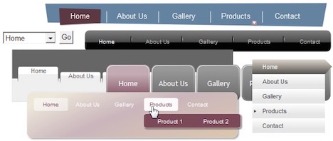
Again, if you have loads of links crowded into a navigation bar, visitors tire of going through them all to find one that relates to what they came here for. And, if there is another link that might be somewhat similar, that can be frustrating. The fix for this is simple:
- Identify several large categories for your posts. Combine similar links and come up with a new term that will encompass them all.
- If you have several sub-categories within a category, use a drop down from the larger category. While drop-downs are not ideal, you will look far more organized and the reader can scan them relatively quickly.
- You can eliminate links for “most popular” or “most recent” by using your side rail. The terms “most popular” and “most recent” don’t tell a reader what those posts are at all. Create boxes for them on the rail and list 3-4 by title. Many bloggers are eliminating these categories altogether.
3. Loaded Sidebar
Do you really need a live traffic feed and a site meter? How about third-party add-ons? How many widgets are really necessary?
- See if you can clean that sidebar up. If it is really loaded, it looks messy and who’s going to bother to look through them all anyway?
- The only one who cares about your traffic feed, rank, etc. is you. You can get that information through Google Analytics and read those reports yourself.
There are 5-6 widgets that you should have:
- Search Box – absolutely necessary
- Subscription Widget – a “must have” – you want readers to sign up to get updates delivered to their inboxes; also, add your
- Social media profile links with this widget
- Recent Posts/Popular Posts
- Archives (these can be grouped by categories too)
Additional widgets can be placed on the footer if you feel the need. And remember, the more widgets the slower the load time.
4. Un-Matched Theme
If your blog is on parenting, using a theme and colors that would clearly be used by a conservative financial institution or a sophisticated high-end jewelry site (think Rolex), then you will not be appealing to your audience. Just as content must be relevant, so must theme.
- Identify your target audience
- If you are not sure about theme and color, check out some of the sites that your target audience visits, or other blogs in the same or similar niche(s) as yours. This will give you ideas for your own theme options.
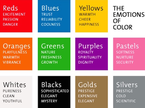
5. Bad Color Palette
Contrasting colors can be dramatic and appealing; but adding too many is clearly a mistake. Bold blue, red, and yellow together are really “no-no’s” unless you are Lego. Here’s an extreme example:

Everything about this page is just wrong – the theme is ridiculous for a stock brokerage firm, and the colors really “cheapen” the message.
On the other hand some color shades that are contrasting can give a nice effect. A site for pre-teen girls, for example, might use shades of purple and green.
Choose colors based upon your niche. Here’s a chart you can use as a basic guide:
6. Content Not Scannable
Big blocks of text that look more like a school essay will never be read. Break it up with visuals (the more the better), bullet points, and bolded headings/sub-headings.
- Use short paragraphs
- Use a good-sized type – no one wants to squint
Remember, your readers want to scan through any content to see if it is valuable to them before they read it. Make it easy for them to do that.
7. Bad Grammar, Spelling, Punctuation
Whether it is on your landing page or any of the other posts on your blog, there is no room for English errors. If you have any issues with writing skills, get a good reference tool or take a refresher course. You are now writing for a living – your reputation is at stake here.
Everything on your site should be easily readable too. Lose the complex sentences and large vocabulary. The key to engaging people is simplicity.
8. Social Sharing Buttons Hard to Find
Readers do share valuable content. They like to “look smart” to their friends. But if those buttons are located only at the top or bottom of posts, then they may forget, or they may not actually read all the way to the bottom.
Scrolling buttons on the side work well. In this way, if something strikes a reader, s/he can share right then and there.
9. Not Setting Up Conversation Capability
The goal of a blog is to engage with amazing content. Taking that engagement further is what you want. This means you give readers the opportunity to share, but it also means you give them the opportunity to ask questions and comment, right there.
And of course, you will set up notifications so that when a comet or question is posted, you can respond immediately.
10. You are Using Too Many Different Fonts
This makes your site look dis-organized and confusing. This is a simple fix.
- Limit yourself to 2-3 fonts
- Be consistent. All headings should be in the same font; the same is true for sub-headings and regular text.
- Of course, you know to avoid fancy scripts that are difficult to read. The operative word with typography is ease of reading.
11. Failure to Place Contact Information to be Easily found
Your contact information should be on every page, either through a “contact us” button or link, or an email address, Twitter handle, etc. at the bottom of each post.
12. You Use Low Quality or Uncompressed Images
With the tools available today, there is no reason for either of these situations. You look unprofessional if your images are fuzzy; and uncompressed images slow down load time.
If you are using WordPress, there are great plugins for optimizing and compressing images.
13. Your Search Box hard to Find or Missing
You must have good search capability, especially for first-time visitors. The search box should not be hidden among other widgets. Put it in a prominent spot in the upper right or surrounded by plenty of white space on your rail. Use a bright color outline to make it stand out.
14. Allowing Broken or Outdated Links to Stand
Nothing is more irritating for a visitor than a link that does not work. Search engines don’t like them either. So do yourself a favor and check your links regularly and make sure they lead where they are supposed to.
- Anytime you add something new, it will not hurt to run a check on everything, including your links.
- Use a good tool, like Broken Link Check, W3C Link Checker, or Google Webmaster Tools.
Well, how did you do? If you found a few things on your blog that may be “suspect,” they are easily fixable. Your visitors and followers will thank you.

You May Also Like:
 7 Tips: How to Get More Comments on Your Blog
 10 SEO Tips: How to Optimize WordPress Blog
 10 Common Web Designing Mistakes to Avoid
 How to Check Broken Links and Dead Links in Website or WordPress Blog Using Broken Link Checker Plugin
 20 WordPress Plugins to Interlink Blog Posts, Pages & Keywords
 Top 10 Ways to Increase Your Website or Blog Traffic for Free
 How to Create a Custom Error 404 Page for WordPress Blog
 8 Serious Web Design Mistakes You Must Avoid


I am expecting more interesting topics from you. And this was nice content and definitely it will be useful for many people.
Being new to the blogging world I feel like there is still so much to learn. Your tips helped to clarify a few things for me as well
Good post it Seems . Keep Posting Like This
Nice to have a useful content and expecting some more tips about blogging
yes, its useful information for bloggers, thanks for sharing.
Hi! Useful Article.
Keep Creating the helpful content.
Regards
Oodles Studio