

Creating Smartphone-Optimized Emails for Marketing
In the late 90s, email marketing emerged on the scene as a unique, highly advanced and extremely effective alternative to the older more traditional marketing methods. Email marketing involved using emails to acquire clients, increase brand awareness and nurture new leads. Personalized e-mails were sent to acquire new customers and retain existing customers, convincing them to purchase a particular product or service.
It’s been more than 2 decades since email marketing took the world of marketing by storm, but it has lost none of its sheen and remains as effective today as it was in the past. It continues offering excellent ROI compared to other digital channels such as social media or online display advertising.
The great thing about emails is they’ve evolved to meet the changing demands of the market and also advanced technology. This is reflected in the fact that today’s emails are optimized for smartphones.
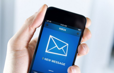
An increasing number of people today are using mobile devices to access their inbox and that is why marketers need to start monetizing mobile traffic through emails. In 2012, The Radicati Group put out a report stating that the total numbers of worldwide email accounts are expected to increase from 3.3 billion to over 4.3 billion accounts by 2016; 730 million of these accounts will be accessed via mobile or tablet devices.
This means it is imperative that marketers follow new email best practices to ensure emails are easy to read on a mobile device, or they will lose out on a wonderful opportunity to reach out to a growing target audience that is accessing its emails through mobile devices.
Here is the list of things you can do to create emails that will make an impression on recipients even when accessed from smartphones:

Keep Your Subject Lines Short
All marketers are aware of the fact that the subject line is the most important factor in email marketing as it persuades the recipient to open the email.
Email subscribers who use their mobile phones to check emails don’t get to see the full subject lines as the screen size is small. In fact smartphones, when held vertically, only display the first 15-20 characters of a subject line. Marketers that are targeting subscribers with Internet enabled smartphones must, therefore, use shorter subject lines for their emails. Moreover, research by MailerMailer has proved that shorter subject lines have higher open and click though rates.
In case you have no other option, but to use a long subject line, ensuring the topic of your email is apparent in the first two or three words of your subject line will help; in this case even if the end of the subject line is cut, you can be rest assured you’ve made your point.
Also, make sure you add the most relevant and exciting information in the first half of the subject line so that your reader is more inclined towards reading your mail.
Use Enlarged Fonts
Emails with tiny fonts are extremely difficult to read on smaller devices like smartphones or tablets. Reading such emails is a frustrating and largely unpleasant experience; most recipients will not read such emails and delete them from their inboxes.
It is therefore recommended that you use 14px as a minimum size for body content of the email and 22px for headlines; this will improve the readability of your emails on mobile devices. By default, iOS devices will automatically resize any text in an email that is set at a font size less than 13px.
Use Single-Column Layout
Many marketers use multi-column emails, but marketers who are optimizing emails for smartphones should consider switching to a single-column layout. Single column layout makes optimum use of the limited space available on smaller screens. Moreover, it also helps you scale between different device resolutions.
Concise Body Content
Readers accessing emails on their mobiles are usually on the go; they will merely skim the email for relevant details, so make sure the content of your email is concise and to the point. This will ensure the message is clearly understood by recipients. State your purpose clearly and give them an offer that will draw them towards your website, thereby generating leads for your business.
Don’t flood your email with information. Create interesting content that drives people to respond. Avoid long paragraphs; instead use bullets to break the content. Put the most relevant information first because your mobile subscribers are on the go and might easily get distracted if the email doesn’t get to the point right away.
If they are asked to continuously scroll through the email, chances are they will stop reading your email. So, ensure the content of the email can be scanned quickly and effortlessly.
Avoid Too Many Images
Many mobile email clients disable pictures by default to increase security and reduce load time. Ensure your marketing email is not overdesigned. An email that is embedded with a large image or too many images can take a long time to load on mobile devices. So keep your emails clear and simple to optimize them for mobiles.
Also, keep track of the amount of graphics that you include in your email. On a mobile device, graphics might take their own sweet time to load; in some cases they don’t load and are displayed as links or blank space. Such emails will look ugly and untrustworthy, leading recipients to delete them without taking a look at the actual message. Remove any JavaScript, Flash and pop-ups from the email, so that your email has a better chance of rendering effectively on mobile devices.
Use a Responsive Template
Consider using responsive email design. Your email is optimized no matter on which device your readers open it. If you use responsive template, you don’t have to worry about your email rendering incorrectly. Career builder increased its email CTR by 21-24% by using a responsive email template.
Clear Call-to-Actions
When it comes to mobile-optimized emails, ensure your call-to-actions are buttons instead of links; buttons are easier to click on a touchscreen. Ensure the purpose of clicking on the button is clear and obvious to the users as confusion is a big conversion killer. Leave plenty of white space around buttons to avoid fat-finger mishap. The button should have a minimum size of 44px*44px.
Mostly the upper left hand corner of your email is displayed clearly on mobiles. Lack of autoscaling cuts off the right side of emails and forces users to scroll left and right, in addition to, up and down to view the entire message. As a result, it is important to place your CTAs in the upper-left corner of your email.
Provide a Plain Text Version Option
Some mobile devices do not support HTML emails due to factors like bandwidth and functionality. This is the main reason you can’t afford not to optimize your email for the plain text version as well. If your email is optimized for both versions and a reader tries to open it in a mobile device that does not support its HTML version, the email will automatically render in a plain text version.
So, optimize your email for both HTML and plain text versions to ensure anyone can read it, regardless of their mobile device’s capabilities. Moreover, when a spam filter sees an HTML email without a plain text version, it’s more likely to suspect the email to be spam. So, it’s a best practice for CAN-SPAM compliance to create text only versions of your email.
Choose Colors Wisely
You can make your emails look more inviting by using the right colors. Also, emails are easier to read when they have uniform colors from beginning to end. Be sure to avoid colors that exude a negative connotation. Avoid red for backgrounds in emails as it shows hostility. Light blue is great for mobile email marketing as it shows calm and peace.
Conclusion
With the exponential growth in smartphone market and increase in the number of email readers on smaller devices, every marketer needs to implement the above mentioned tactics to ensure their subscribers receive flawless smartphone optimized emails on their Android, Blackberry or iOS devices. These tactics will significantly improve open and click through rates of your marketing emails.

You May Also Like:
 10 Tips for Having an Optimized Digital Marketing Campaign
 Common Email Marketing Mistakes & How to Avoid Them
 How Mobile-Optimized Sites Can Help Boost Conversion Rate
 16 Online Services to Send / Receive Anonymous Emails
 5 Tips for Taking Your Company Website Mobile and Creating Apps
 How to: Easy Ways to Stop Getting Spam Emails or Junk Mails
 10 Ways to Ensure Your Email Marketing Campaign is Working
 How To: 6 Best Ways and Tools to Backup Gmail Emails
Tags: e-mail, email marketing, marketing, smartphone