

How Mobile-Optimized Sites Can Help Boost Conversion Rate
The emergence of Smartphones has revolutionized the mobile industry. It has defined an advanced way of communication along with myriads of useful features that have bought immense comfort and luxury to the users.

Gone are the days, when mobile phones were only used for communicating with others via simple text messages or voice calls; however, today, it can be observed that over 1.2 billion users access the Internet through their Smartphones. Moreover, the surveys have also depicted that a quarter of the total searches are made through mobiles and more than 15 percent of the global Internet usage is accounted by the mobile traffic. Hence, it’s clear that how imperative it is to create a mobile-optimized website.
If one considers all the factors that help engage potential users to a mobile site or an application, the major component that facilitates users to flow through a mobile application is Navigation. Therefore, while optimizing a mobile site, one must ensure an efficient and convenient navigation.
Induce Potential User Engagement with a Mobile-Optimized Website
A mobile-optimized website boasts the web content in a precise and uncluttered fashion that allows users to easily navigate through and search for a requisite stuff. Most of the websites have reaped the incredible benefits by developing a mobile site. It not only helps target a huge mobile audience base, but also facilitates businesses to generate greater returns and profits.

In fact, it has been also observed that the websites with a mobile-friendly version features a noticeable reduction in bounce rate and a significant increase in the number of page views and searches. Hence, creating a mobile-optimized site will definitely allow sites to garner the better user engagement and accentuated ROI.
The mobile websites offer better user experience and enhanced navigation than the desktop version, as users can zoom-in a web page with a pinch on a Smartphone, access controls via simply taping, etc. This helps gain accentuated conversion rate and potential consumers.
Mobile Site Design Plays a Significant Role

Designing is the most crucial aspect of any website, and when mobile websites are considered it becomes more important. Since, unlike desktop sites that are displayed over a large-screen device, the mobile sites have only limited space. Therefore, every text, control buttons, images and other web content contribute greatly to a site design.
A well-tailored website design showcases a keyword-rich web content that allows the search engine bots to easily crawl and index the appropriate results. Not only this, but, the intuitive designs also help site viewers to conveniently browse and navigate the site with ease and thus, offer a noteworthy increase in overall conversions.
Mobile-Optimized Landing Page also Adds to the Better Conversion Rate
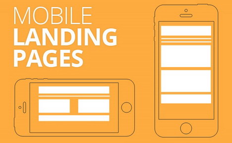
Knowing the fact that the mobile devices don’t boast a screen as large as desktops, adding content precisely on the landing page of a mobile site will definitely help enhance the conversion rate. It might not look as slick as the desktop page but, representing only the requisite information over the landing page will offer significant results.
Moreover, certain surveys have also depicted that mobile optimized sites and apps are completely worthwhile. Hence, it is advisable to develop an efficient mobile-friendly site and boost your business values and profits.
Here are a few of the worthy tips that can help you create a superlative mobile site.
- Integrate all the essential information and links at the top of the web page.
- Insert easy-to-click links to ensure a seamless user experience.
- Single column layout and mobile-friendly dropdown is ideal for better navigation.
- Facilitate handy search bars to make searching a breeze.
- Don’t forget about the mobile-only features, like, you can offer the site viewers to directly call on the numbers available under the contact us column of a site.
- Less mess means less fuss, that is keep the navigation to the minimum.
- Ensure that the site content is easy-to-read and easy-to-tap. It is advisable to keep the content that is expected to be taped around 30 to 40 pixels in size.
- To minimize the site loading time and to make it easily accessible, keep the web content as precise and germane as possible.
Enhance your businesses and improve your sales and services by creating a mobile-friendly site. You may use the above mentioned valuable tips to optimize it and reap the complete benefits of the growing popularity of the Smartphones.

You May Also Like:
 12 Sites to Send Free Sms Text Message from PC to Mobile
 15 Tips to Boost Your Facebook Post’s Click Through Rate
 5 Tips for Taking Your Company Website Mobile and Creating Apps
 20 Sites to Download Free Wallpapers for Mobile & Desktop
 How Online Banking Sites Mastered Their Web Design
 10 Most Harmful Mobile SEO Mistakes
 8 Best Web Services to Convert Website and Blog for Mobile Phones
 Best Mobile Plugins for WordPress Blog
Tags: smartphone, web design resources, web development resources