

How Online Banking Sites Mastered Their Web Design
By now, most industries are well aware of the fact that more than half of the American population own a smartphone, and 36% of the same population owns a tablet. Last year, mobile device sales were actually significantly higher than desktop sales. But what does this mean for the financial industry?

Everyone has a website nowadays and banks are certainly no different. How a site is designed and the features that it has to offer can often mean the difference between success and failure on the internet. Websites should be appealing to the eye, but more importantly, be friendly to the user and have functional features.
While the majority of financial websites have been slow in entering the modern world of technology, more and more of these financial institutions are taking design cues from a more mobile friendly viewpoint that offers their customers sophistication, familiar icons and simplicity. These sites should be a model for other businesses to follow to please their consumers on a more contemporary level.
Here are five examples of banking institutions that are getting more customers to join them online rather than over the counter. If you are thinking about ditching your big, boring bank, along with their difficult-to-navigate website, take a look at some of these impressive, click-worthy adversaries:
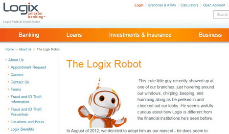
Who could resist a cute, little image of a robot that guides you through a website? Logix adopted their robotic mascot back in August of 2012 and then launched a Facebook campaign to name the new addition to their banking family. After over 4,500 submissions in just a month, Robix was successfully named. Their website is not only visual and more futuristically appealing, they also make banking more well, more fun and interactive.
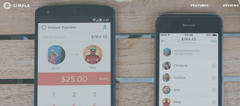
What could be easier than simple (dot com) when it comes to basic features and functions? Geared more towards our ever-growing mobile marketplace, Simple offers a wide variety of tools that are specifically geared towards our hand-held devices. Their menus are very user-friendly, directly tied to popular mobile icons and they have rave reviews and testimonials from their customers.
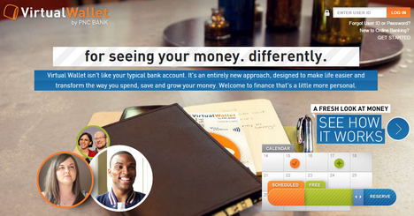
In additional to their more traditional banking functions, PNC is giving Apple Pay a real run for it’s money, literally, by offering their own virtual wallet feature. They are promoting that customers will see their money differently and their online billfold isn’t anything like a typical bank account. They are boasting a more personal approach that is “designed to make life easier and transform the way you spend, save and grow your money.” Although PNC also accepts Apple Pay, their wallet has more tracking features to see exactly where your money is, was and where it is going.
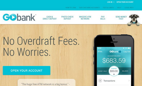
Another basic design with mobile-friendly functions and features, Go Bank’s mobile apps allow their customers to build their own budget and “ask a fortune teller” financial questions. You can make inquiries to your hand-held money soothsayer regarding important financial decisions or simply ponder the purchase of a big-ticket item to see if it is within your budget. This “on-the-go” banker is a smashing success with those who are constantly hustling and bustling in today’s digital age.
Last, but certainly not least, this final example isn’t really an online bank per se, but it is a banking-related site and is definitely worth mentioning and some consideration of a valuable, free service.
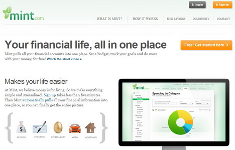
While some of us are drowning in today’s technology, most of us are also having trouble keeping up with all of our many different bank accounts, credit cards, financial plans, retirement accounts, profit sharing, managing our mortgage and auto loans – and the list seems to go on and on. At Mint, you bring all your finances into one location. With all these figures and information in just one place, you can more effectively manage your complete financial picture. Also available on your mobile device for access almost anywhere.
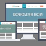
The Value of Responsive Design
The sites featured above have truly mastered their simplistic design and usability to effectively approach their responsive design and connect with their customers. Unlike apps or mobile-friendly sites, a fully responsive website is able to provide the visitor the best experience regardless of what kind of device they’re using or how they are accessing your site. By utilizing marketing messaging, full site content, and getting full functionality for your site, this can result in a higher level of engagement from your customers. This can also potentially increase ROI from your website.
So what can we learn about responsive web design from these mobile sites?
Be mobile-friendly. While there are many surveys and studies that reveal to us who is using mobile technology, the question we all want answered is “Who isn’t using a mobile phone/tablet/etc.?” It makes sense that now with this technology customers can interact with brands when on-the-go, but reports have shown that more than 40% of mobile users either find it difficult to interact with a mobile site or navigate the site at all. In the past, having a website was enough, but in order to provide customers the best experience today, all devices need to be covered.
Be marketing-friendly. Naturally, the more responsive your website is, the more marketing-friendly it will be. Because your site’s single URL cannot be ranked between mobile and non-mobile traffic, Google must advocate responsive design from an SEO perspective. With that in mind, brands need to combine their inbound marketing strategy with responsive design in order to get the best SEO results.
Within the past few years, responsive design has grown to become one of the most essential tools in digital marketing. Take a look at your site’s analytics when you have a moment and analyze the trends you see in mobile and tablet traffic each month to your site. The more it continues to grow, the more crucial it will be for your site to rebuild with responsive design in mind.

You May Also Like:
 7 Online Transaction Services Similar to PayPal
 How to Convert Web Design to Codes? Try These 20 Online Tools
 5 Tips for Taking Your Company Website Mobile and Creating Apps
 Are Payment Apps the Future of Banking?
 How Mobile-Optimized Sites Can Help Boost Conversion Rate
 The Best User Interface Design in a Responsive World
 Top 10 Best Educational Sites for Online Learning & Courses
 What You Can Learn About Website Design from Gaming Websites
Tags: finance, web design resources