

WPTouch Plugin: How to Create & Configure Mobile Version WordPress Website
In the recent years, more and more people browsing web through their mobile devices instead of desktop computers. So if you are really serious about running a website successfully, ‘mobile web design’ is the trend that you can’t afford to miss. Comparing to conventional web design developed for desktop’s web browser, mobile optimized websites significantly reduce page load time and give great browsing experience to mobile device users.

If your website or blog is powered by WordPress and you would like it to go mobile, then you can check out our previous post that recommends some WordPress mobile plugins for you to create mobile version website in minutes.
Last week, our Quertime.com has released the mobile-version with the help of WPTouch plugin. We spent hours to tweak the configurations giving the best browsing experience to our wide mobile audience. Sharing is caring, we thought it will be good to share with you the settings we’ve made and changed so that you can use it as a reference when you decide to set up yours.
Configuring WPTouch Plugin
After installing the WPTouch plugin, on your WordPress Admin page click the ‘WPTouch’ located at the left sidebar. Now let’s configure the plugin starting from:
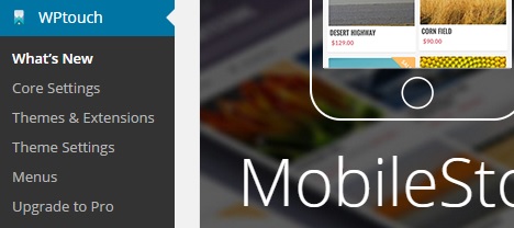
Core Settings
Under ‘General’ Tab
Site Title & Byline:
– e.g.: Quertime – Provide Useful Websites, Tips, Tools and Freebies.
Regionalization:
– Select ‘Auto-detect’ or ‘English’.
(Note: The WPTouch admin panel and supported themes will be shown in this locale.)
– Check the ‘Translate administration panel text’ box.
Display Mode:
– Choose ‘Normal (active for all mobile visitors)’.
Landing Page:
– Choose ‘Default (same as WordPress)’.
Desktop / Mobile Switching:
– Check the ‘Show switch link in mobile view’ box.
(Note: This will show toggle button in the theme’s footer allowing users to switch to your desktop theme.)
Custom Code:
– Enter any custom code here such as HTML, JavaScript and statistics to be output in the theme footer.
Tools & Debug:
– Check the box of ‘Use jQuery 2.x in themes (faster for mobile devices) instead of WordPress’ version’.
(Note: jQuery 2.x is significantly smaller and faster than previous jQuery versions. However it may cause problems with other plugins so use it carefully.)
Admin Mode:
– Set the Admin panel settings as ‘Advanced’ so that you have more settings to be configured.
Now you can save the changes and preview the theme. Or you can click on ‘Compatibility’ tab for further configuration.
Theme Settings
Under ‘General’ Tab
Blog:
– You can set number of posts (e.g. 10) in post listings. This overrides the WordPress Reading settings for “Blog pages show at most”.
Post thumbnails:
– Choose ‘All (blog, single, pages, search & archive)’
Thumbnail Selection:
– Select ‘Post featured image’.
– Check the ‘Show post categories and tags’ box and the ‘Show search in header’ box.
– Depending on your needs, you can also show post date, post author as well as comment bubbles on posts.
Featured Slider:
– Check the ‘Enable featured slider’ box.
– Select the maximum number of posts (e.g. 3 posts, 5 posts or 10 posts) shown in the slider.
– Check the ‘Automatically slide’ box.
Now save the changes you’ve made.
Under ‘Branding’ Tab
Theme Colors:
– Choose colors for your theme background (e.g. #f9f9f8), header & menu (e.g. #f8f8f8), links (e.g. #35c4ff) as well as post/page headers (e.g. #777777).
Site Logo:
– Upload your website’s logo. The optimum logo size is 88px in height and up to 420px in width. This helps to optimize visual display.
Typography:
– Select font style e.g.: ‘Lato & Roboto’.
Sharing:
– Check the ‘Show sharing links’ box and the ‘Show sharing links on pages’ box.
– Choose ‘Above post content’ for sharing links location.
– Choose ‘Social network colors’ for color scheme.
Footer Social Links:
– Enter the full URL of your social profile links such as Facebook page, Twitter profile, Google+ profile, email address, URL to your RSS feed, etc.
Save the changes you’ve made for your theme’s branding.
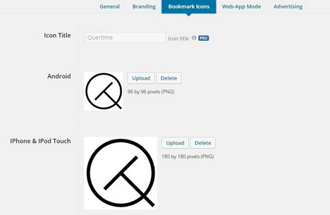
Under ‘Bookmark Icons’ Tab
– Upload your site’s bookmark icon for Android phones, iPhone and iPod Touch. The size of the image for Android shall be 96 by 96 pixels (PNG) while the image size for Apple devices shall be 180 by 180 pixels (PNG).
Save changes.
Menus
Under ‘Theme Menus’ Tab
Header Menu:
– Select ‘Navigation Menu’ as header menu.
Menu Options:
– Check both ‘Enable parent items as links’ and ‘Use menu icons’ boxes.
Save changes.
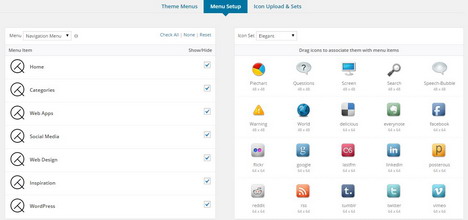
Under ‘Menu Setup’ Tab
Here’s the place where you can choose and drag icons to associate them with the menu items.
Save changes.
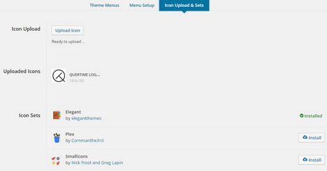
Under ‘Icon Upload and Sets’ Tab
On this setting page, you can upload your favorite icons, view the icons you’ve uploaded as well as install icon sets designed by some professional web designers.
Save changes.
Optimizing Caching Plugins to Work Well with WPTouch
Most of the WordPress websites are installed with caching plugin to speed up the site performance. However, if these plugins aren’t properly configured, they may override WPTouch and cause non-functioning mobile theme’s appearance.
Some problematic examples you may see include:-
- Cached posts and pages shown using desktop theme on mobile devices, or vice versa.
- Inconsistency of both mobile and desktop themes when the website is refreshed.
The good news is that most of the caching plugins can be configured for mobile use by disabling the caching functionality when mobile devices are detected.
Optimizing WP Super Cache for Mobile Use
Our website Quertime.com is installed with WP Super Cache plugin, hence we would like to show you how we configure the cache plugin so that it works well with WPTouch.
1. Go to WP Super Cache settings, under ‘Advanced’ tab, check the ‘Mobile device support’ box and click the ‘Update Status’ button.
2. On the same setting page, scroll down further to ‘Rejected User Agents’ section. Copy and paste below mobile user agents’ list into the field and click the ‘Save UA Strings’ button.
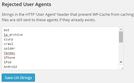
iPhone
iPod
Android
BB10
BlackBerry
webOS
IEMobile/7.0
IEMobile/9.0
IEMobile/10.0
MSIE 10.0
iPad
PlayBook
Xoom
P160U
SCH-I800
Nexus 7
Touch
3. Under the ‘Easy’ tab, scroll down to ‘Delete Cache Pages’ section and click the ‘Delete cache’ button to clear all the cached posts, pages and other stored files. Alternatively, under ‘Contents’ tab, you can click on ‘Delete Expired’ and ‘Delete Cache’ buttons for the same purpose.
Now the WP Super Cache should be able to ignore your specified mobile user agents while the still caching posts and pages viewed on desktop.
You May Also Like:
 How to Setup and Configure WP Super Cache Plugin for WordPress Blog
 How to Check Broken Links and Dead Links in Website or WordPress Blog Using Broken Link Checker Plugin
 Best Mobile Plugins for WordPress Blog
 How to Speed up Page Load Time on Your WordPress Blog Using W3 Total Cache Plugin
 nrelate’s Related Content Plugin and Most Popular Content Plugin for WordPress, Blogger, Tumblr and Other Platforms
 How to Install and Setup W3 Total Cache Plugin for Your WordPress Blog
 How to Create a HTML Sitemap for Website or WordPress Blog
 How to Create a Custom Error 404 Page for WordPress Blog
Tags: mobile phone, plugin, web design resources, wordpress resources