7 Ideas To Create a Perfect Email Banner
Which elements of email do people see first of all? When the inbox message is not opened yet, that’s subject line and (optional) preheader text. With Gmail, other pre-opening things are their promo annotations but this innovation is a matter for separate posts as well as subject lines… so let’s skip them and proceed with the next stage.
Well, the email subject turned out to be strong enough and the recipient opened it. Regarding promo newsletters, the very first thing people see in the email body is a banner.

Should we scroll the email down to the bottom or just close and remove it? Banner is a key factor to make this decision. It’s the face of the promo campaign and has a direct impact on performance rates and overall success. Therefore, we should design it outstanding, noticeable and attractive.
Is This Challenge Complicated?
In fact, not too much. Today there’s a wide variety of tools to ease your work. Stripo.email template builder, NiftyImages to work with pics, etc. – you can easily create professional html emails with no coding skills. Moreover, modern tools save us from a time-killing routine. For example, that toil with Photoshop during image editing. After you’ve created your design export to the email services to check how it fits email design… and start over if it’s not ok. It was kinda “perfectionist’s hell”, as we repeated the whole sequence until a satisfactory result is reached.
Now things are much better as email marketing tools are equipped with embedded photo editors and other helpful features. Complex multi-layered banners are designed in no time, right in the editor. That’s why banner crafting is rather about imagination, aesthetics and original ideas than technical issues. We’d like to share some creative ideas on how to boost email banner performance.
Prior to these seven tips, there is one binding step – let’s call it 3D…
Determine, Decide and Define
Maybe you already have a “virtual image” in your mind, a 100% clear understanding of how your banner should look like. It means that you completed this mission without our help 🙂 Regardless of that, we’ll talk about this.
Think everything through and crystallize the precise idea of what exactly you need and how your banner should look like according to the campaign goals and specifics. As for banner design, it’s a bit edgy task. Make efforts to find the right balance between brand consistency and visibility. More precisely, it’s a dubious solution to make a banner and the rest of the email in the same corporate style – color scheme, fonts, etc. Banner may become not noticeable enough with this approach. Therefore it must be contrasting anyway… On the other hand, the banner must harmonize with the entire newsletter style. Don’t make people run to the ophthalmologist after your promo campaigns 🙂
Regarding the technical side, there are common types of banners. After goals are determined and the design concept is defined, you’ll easily decide what type is best for an actual campaign. Here they are:
- single image banners
- two images banners
- framed banners
- banners with CTA button
- photo collage banners
- banners with transparent additional pics
- GIF animated banners
- video banners
- AMP-carousel banners
Along the baselines of this classification, let’s review the ideas we announced in our post title.
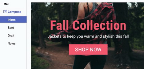
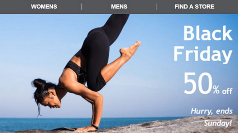
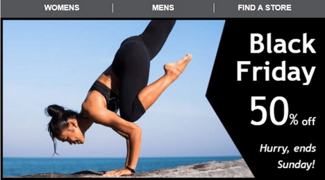
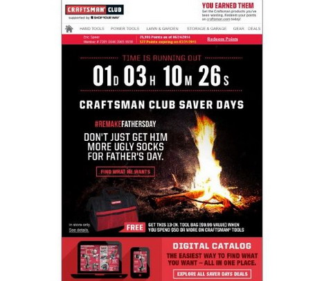
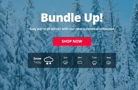
1. Simple yet Stylish
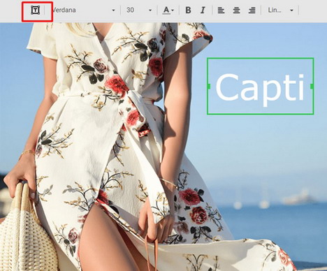
Following the logical order, we begin with a single image banner as this basic type is the simplest and the most commonly used by email marketers. It consists of one single image and value proposition copy over it. Pure technical minimalism, yet we can make it stylish and not so primitive. However, minimalist design may be just amazing… when done with the proper approach, of course.
As for design and copy, apply all your creativity and ideas. You can arrange a simple or complex image – as we said above, modern tools provide email marketers with robust sets of features and options. Edit images, add filters and color effects etc, wrap text in festive or even custom fonts… today it’s not even an advantage but rather a default condition. We recommend choosing a tool where an image and copy processing is available right in the editor. It saves quite a bit of time when no third party services are needed.
Another Tip: Good email builder should rearrange banner into integral format. This way, copy wrapped in custom font becomes a part of the whole image – so it won’t be broken with ESPs and email clients if they don’t support certain font.
But even with simple-minded font, design may look exciting. Like in the example below: a strong statement becomes even stronger when written in such an old-school manner, no new-fashioned tricks.
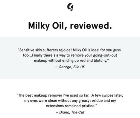
One more idea about content: add the best feedback from your clients. People’s opinion really works so why don’t you use the most compelling comments to promote?
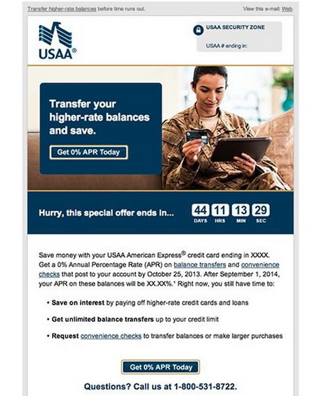
Some marketers also add countdown timers below banners. I’ve even met timer right in the banner but it’s technically hard to make. A much better trick is to configure both banner and timer design in the same style and then combine seamlessly. As a result, it would look like as a timer embedded in banner 🙂
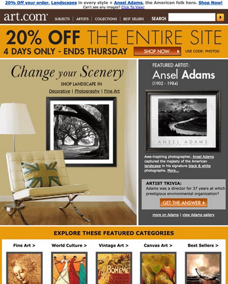
2. Multilayer Imagery, Frames, and Transparency
From single-image banners, we move on to more complex types. Besides the option to combine pics according to your ideas, multi-image banners are an opportunity to solve designers’ problems with the proper combination of font color that fits the image it added upon. Just look here: an additional blank image is added just to write copy and add menu items over it.
To strengthen visual impression and emphasize text (or important parts of images), or follow brand book style – apply frames. They are typically offered by photo editor tools, or you can upload custom banners. Take a look at these examples – how do you think which one is better?
We also recommend trying out transparent images. The principle is the same – adding an additional image to multi layered banner. A noticeable solution is to make the text more legible, create a holiday mood… or just implement fresh designer idea 🙂
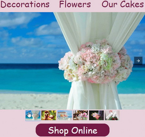
3. …And Even Collages
The following idea is good for different purposes. For instance, in tourism and hotel industry to attract with photos of beautiful places you invite prospects to. Restaurants may add more images of appetizing dishes. All in all, it works when multiple imageries are needed. For gadgets stores, it’s a way to show pics of various product categories right in the banner: PCs, notebooks, tablets, smartphones, etc.
The same goes for fashion…
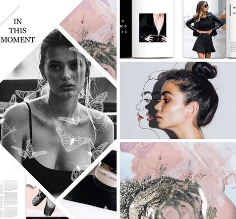
You need to work a bit here as this banner is a composite structure. But don’t be afraid, it’s quite simple. The banner is built of several rows where you add the needed images and write CTA text. And then unite them 🙂
4. GIF? Animate Without Hesitation
GIFs are too multi-purpose to explain here. Whether you want to draw attention to value offer, show extended assortment of products in one screen, promote several offers in one newsletter, show new device in action, or maybe you have more kinky ideas 🙂 GIF to the rescue!
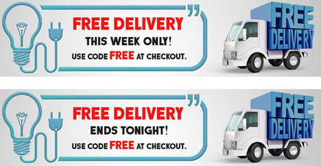
Upload them just like static images – and add any copy over them. Pretty easy. One more creative tip: GIF is another “backdoor” to appeal to the sense of urgency and add timers. More precisely, “timers” – in fact, it will be a timer simulation, not a real countdown… No matter. You may place a real countdown timer block below to show real time… While “timer” GIF is only meant to make a first impression and say that time is ticking away.
5. Where is Videos Place? Yes, It’s Banner
When we use video wisely it becomes our perfect assistant to enhance relations with recipients, show value offer in a visual way, express the advantages of new product or service, and many more.
When video is placed at the top of email it serves as a banner. Why not use them for promo campaigns? When necessary, of course.
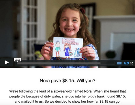
You can embed video in banner block, or add thumbnail image with the “Play” button image and attach the respective link to Youtube, Vimeo, etc. With embedded videos, please be a kind person, not hardcore Apple worshipper )) The matter is that embedded videos playback is available for Apple devices only – so don’t forget to provide non-Apple users with fallback. I.e. with the aforementioned thumbnail and link.
This image is not a video – but it looks like one 🙂
6. Where to place CTA? I guess you know 🙂
Continuing the last sentence in the previous paragraph, CTA in the banner is not a CTA. But this barely technical aspect is insignificant when everything is arranged well.
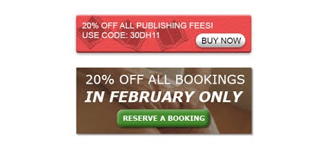
In a nutshell: we’ve just added the image of the CTA button to the banner image in a photo editor. It surely should look harmonic and be noticeable – a basic requirements for CTA items. Accompany it with compelling text – on “button”, above it (or below)… And add the right link to the banner image.
This method is good to boost the CTA effect – hard to skip button when it placed on the banner, and its appearance is bright. Yeah, the whole banner is clickable so the recipient may click any place – result will be the same (redirect to a landing page or other action performed). But he or she would rather click the “button”, it’s caused by psychology.
7. And Some AMP-Powered Next Gen
AMP 4 Email is an innovative technology in email marketing. Brands and companies only just started its implementation, and far not all ESPs and email clients support it. But forecasts are obvious – AMP will be common very soon. We all know that sticking to hot trends is essential for ecommerce specialists so using new-fashioned AMP-powered elements may be an epic win for your business.
An AMP-powered banner is a carousel with 3 to 16 banners added to one compact block. The user clicks the “Slide” button to switch between them. This is not a simulation this time but real applied interactivity. So it helps much to engage customers and to make the banner a functional item.
So be among those who implement AMP in promo emails first! With AMP-powered emails, you’ll be an outstanding sender.
Summing Up
Once again, banner is the very first thing clients see when email is opened. So pay close attention to the smallest details, make wise decisions – and preview and test everything before sending! Remember that winner is always winner – but fails are fails, apologies are weak in this case.
We wish your campaigns to be much more powerful and effective – let them bring you conversion, incomes and loyal clients. Good luck!

You May Also Like:
 Top 24 Best Email Newsletters, Email Marketing and Email List Services
 25 Ways to Create and Test Email Newsletters
 14 Dummy Text Generators to Create Filler Text for Your Web Design Prototype
 18 Best Free Websites to Create Animated GIF Images (2025)
 80 Most Popular Email Templates for Smartphones and Tablets