Unveiling 20 Famous Logo Designs with Hidden Messages
Logo is an important graphic or word mark that helps a company or an organization to attract people’s recognition. Creating a unique logo has always been a challenge to graphic designers. To make it exceptional and outstanding some designers will secretly hide a message or even a story inside the logo.
Logo embedded with hidden message gives viewers a little puzzle to solve. Once viewers managed to get the hidden message behind the logo it creates an instant satisfaction which makes them talking about it and sharing with others.
Today we would like to showcase 20 famous company logos with hidden messages that will blow your mind away. Let’s unveil the secrets!
1. Apple
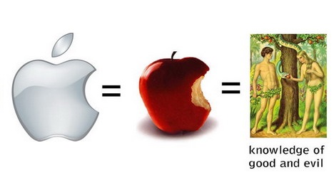
Let’s start with the famous Apple logo. It shows an apple that has been bitten. Many people like to believe that the logo symbolizes the forbidden fruit of Adam and Eve, depicting knowledge and lust. Others thought that the bite in the logo refers to the computing term ‘8 bytes’.
2. Wendy’s
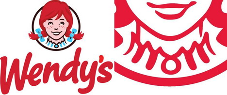
In the Wendy’s logo, there’s a word ‘Mom’ written along the ruffles of the girl’s collar.
3. Sony Vaio
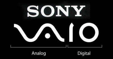
Sony Vaio’s logo shows the integration of analog and digital technology. The ‘VA’ signify analog waves while ‘IO’ represents binary 1 and 0.
4. LG
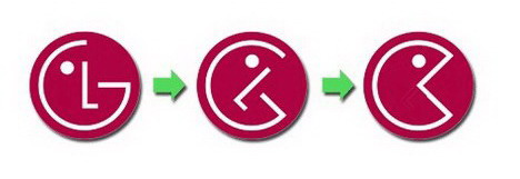
This isn’t a hidden message, just how LG logo can be transformed into Pac-man!
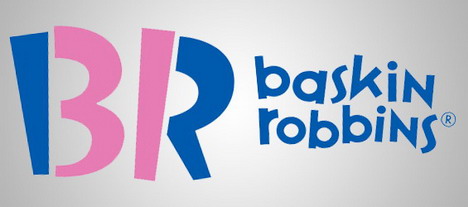
5. Baskin Robbins
In the Baskin Robbins’ logo you can see the number 31 colored in pink because they have 31 ice-cream flavours to choose from. Nice design!
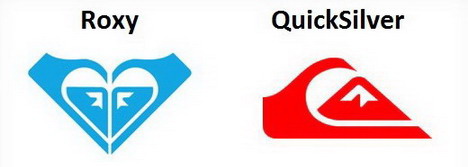
6. Roxy
Did you realize that Roxy’s logo is actually consisted of two copies of the Quiksilver logo, forming the shape of heart?
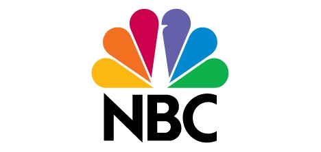
7. NBC
The famous American broadcast television and radio network – NBC also joins the list. Its colorful logo, above the text, has a hidden peacock with its head looking to the right.
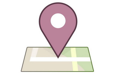
8. Facebook Places
Facebook geolocational service Facebook Places’ logo has a ‘4’ in a square. Does it mean something to the current leader in the space Foursquare?
9. Yoga Australia
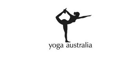
In the Yoga Australia logo you’ll see a women’s silhouette in a yoga pose. However if you look carefully, you’ll notice that the negative space between her arm, leg and hip form the Australia’s map. The logo is simple and sophisticated at the same time.
10. Amazon
In the Amazon logo, there’s an arrow pointing from a to z. This signifies that Amazon selling everything from a to z. Apart from that the curve of the arrow represents customer’s smiling face.
11. Toblerone
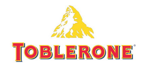
Toblerone, the famous Swiss chocolate brand, also has something hidden inside its logo. If you look closely, you’ll see a dancing bear (white space inside the mountain).
12. Eight
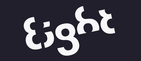
The ‘Eight’ is another creative logo designed with a typeface where every letter is a variation of ‘8’.
13. Sun Microsystems
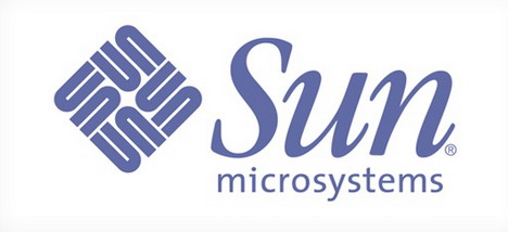
The Sun Microsystems’ logo creatively displays the ‘u’ and ‘n’ letters that spell out their company name ‘Sun’. You can read the word ‘Sun’ from various directions.
14. Snooty Peacock
The jewelry store Snooty Peacock has an impressive and beautiful logo. It’s designed with a lady wearing jewelry, but did you notice that there’s a peacock hidden in the face?
15. Electric
The ‘Electric’ hidden logo makes use of negative space creatively, by hiding a plug and a cord inside the word.
16. CounterCurrent
This is another logo that presents a clever use of negative space. The space between four arrows creates another arrow pointing to the opposite direction. It beautifully signifies the meaning of CounterCurrent.
17. FedEx
The FedEx logo looks nothing special, just a plain text. However if you look closely you will notice that the space between ‘E’ and ‘x’ create an arrow which means fast and accurate delivery.
18. Eighty20
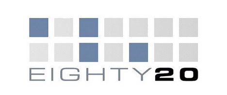
The Eighty20 logo’s hidden message is pretty difficult to figure out. The 2 lines of squares represent a binary sequence with the blue square being ‘1’ and grey square being ‘0’. So the first line is 1010000 which converted into 80 while the second line is 0010100 to represent 20.
19. ED
The designer of ED (Elettro Domestici) logo creatively used the negative space formed by the letter ‘E’ and “D’ making it looks like a plug.
20. Milwaukee Brewers
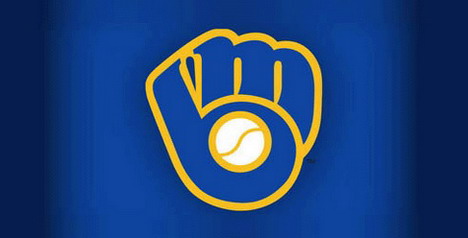
In the first sight, you’ll see the old Milwaukee Brewers logo looks like a catcher’s mitt holding a ball. Actually it’s more than that. The logo can also be interpreted as ‘M’ and ‘B’ which are the team’s initials.
21. Hope for African Children Initiatives
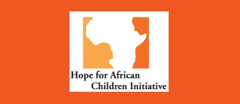
The ‘Hope for African Children Initiatives’ logo may look like the Africa map in the first sight. However if you take a second look, you’ll see an adult and a kid facing each other.
22. IBM
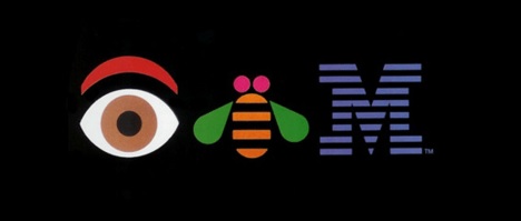
This IBM logo was designed by Paul Rand for the company’s internal event. It contains an eye, a bee and a ‘M’ letter, pretty eye-catching.


