Showcase of FIFA World Cup Logo Designs 1930 – 2014
The fascinating FIFA World Cup is just around the corner. Football fans from all over the World will once again be crazy about the most celebrated tournament. Before the game kick off, we at Quertime would like to take the opportunity to let you review back all the World Cup logos and see how they evolve throughout the years.
The World Cup logo is important to represent the host country conveying their message to the World. It’s also the identity of the World Cup event. When you look at the logo, it might bring to mind all the highlights from that particular year of tournament.
Below we’ve rounded up all the official FIFA World Cup logo designs from the first event in Uruguay (1930) to the year of 2014 in Brazil. Don’t forget to comment on which logo you love the most.
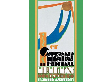
1930 – Uruguay
The very first World Cup tournament was hosted in Uruguay. From its logo design, we can see a goalkeeper wears a blue (representing Uruguay’s flag color) jersey saving a ball from the goal.
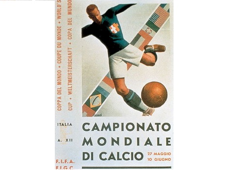
1934 – Italy
This poster shows a football player kicking a football. His jersey and pants are colored in green and white representing the colors of nation flag of Italy. Apart from that, you can see a number of flags of participating countries are placed in the background. This shows that the World Cup is a global tournament.
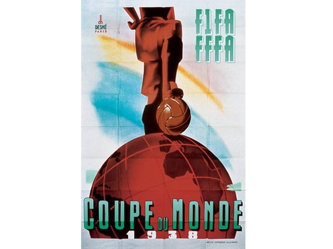
1938 – France
This year’s World Cup tournament was hosted in France. This was the last World Cup to be staged before the outbreak of the 2nd World War. From the poster, we can see a football player stands on the globe with a ball under his feet. This symbolizes both dominance and victory, sending a strong message of challenge to other nations in this worldwide competition.
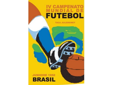
1950 – Brazil
From the poster with its background color of yellow, blue, and green, it’s not difficult to guess Brazil is the host country for 1950 FIFA World Cup. The global football tournament finally continued after missing two rounds of events due to outbreak of 2nd World War.
1954 – Switzerland
Switzerland World Cup design is pretty easy to understand. With the white cross printed on the red football signifying the flag of the nation. The globe design in the background implying it’s an international tournament.

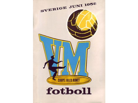
1958 – Sweden
Sweden was the host country of the sixth staging of the World Cup. The VM letters in the logo’s background stands for Världsmästerskapet. It means World championship in Swedish. The big ball and football player in the kicking position simply tells you that it’s a football event.
1962 – Chile
The stadium in the center of the logo with Chile’s nation flag being placed on the ground symbolizing the Would Cup is taking place on their ground. The background of the logo design is half football at the top while the bottom is half globe.

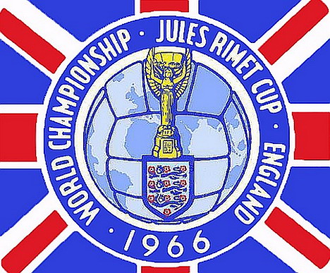
1966 – England
From the logo design it’s easy to guess that England was the 7th FIFA World Cup host country. With UK flag as a background and Jules Rimet Cup (previous trophy design) in the middle implying that England will be the winner of the tournament.
1970 – Mexico
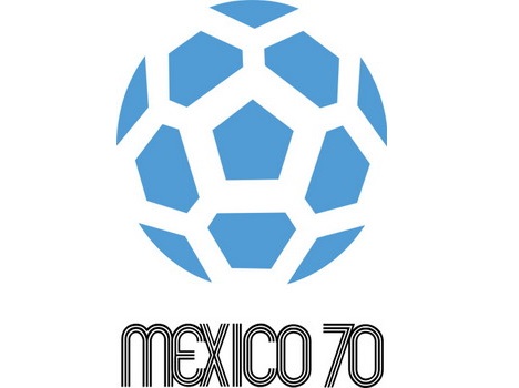
Stripping down the traditional poster styled design for the first time, Mexico’s World Cup logo is surprisingly simple by using positive and negative spaces to depict the shape of the football. Accompanying the football design is the ‘Mexico 70’ text.
1974 – Germany
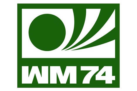
Continued with single-color and text at the bottom design commenced by Mexico, Germany chosen green color for its World Cup logo. The text ‘VM’ is short for Weltmeisterschaft meaning World Cup in German.
1978 – Argentina
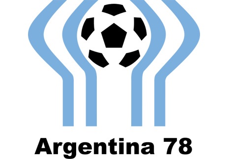
Argentina’s World Cup logo applied similar design concept from the previous two logos, but the host used 2 colors instead. With the black colored football at the top and ‘Argentina 78’ text at the bottom the logo can effectively catch viewer’s attention. The blue lines surrounding the ball are to signify the national flag of Argentina.
1982 – Spain
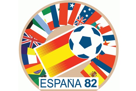
Spain’s World Cup logo is colorful. With the Spain flag and football prominently placed in the middle, surrounded by flags of the other participating countries and the ‘Espana 82’ text at the bottom, the logo expresses its message clear.
1986 – Mexico
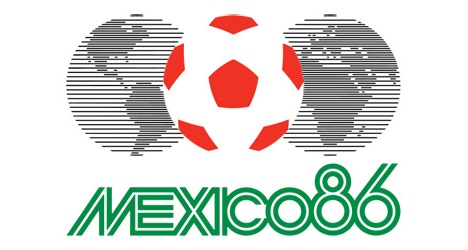
Mexico is the host to the World Cup for the second time. This time their logo is designed with a football being placed in between 2 globes. Again the text ‘Mexico 86’ colored in green is located at the bottom.
1990 – Italy
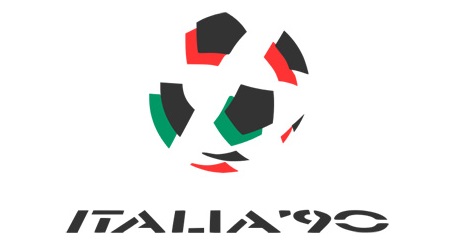
After half of a century, the event goes back to Italy again. This time Italy chose minimalist logo design. Only 3 colors are used in the logo design namely green, red and black. The design is nothing more than a ball and ‘ITALIA’90’ text.
1994 – USA
For the first time the event was hosted in United States. The logo was inspired by the American flag where it features red and white strips and a blue football kicked diagonally.

1998 – France
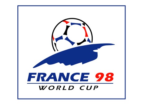
France’s World Cup logo is very creative and impressive though it’s simple. The design features a football rising from the horizon of the Earth (colored in Blue) as if it’s the Sun. The blue and red colors from the French flag as well as black color are nicely mixed.
2002 – Korea / Japan
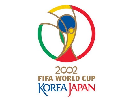
2 years after entering a new millennium, the World Cup, for the first time hosted in Asia country namely Korea and Japan. The logo features a World Cup trophy in the middle, surrounded by the ring. Blue, red, yellow and green were used in the logo making it colorful.
2006 – Germany
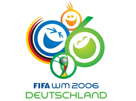
This is by far the most cheerful World Cup logo. Featured 3 adorable smiling face in the shape of ‘0’ and ‘06’. One thing that’s worth to be mentioned is that 2002 logo was also featured in the design.
2010 – South Africa
For the first time, the event was hosted in African continent and South Africa was the lucky one. The logo is so colorful featuring a player performing a bicycle kick on a football. The trophy from the 2002 logo has once again featured in the design.

2014 – Brazil
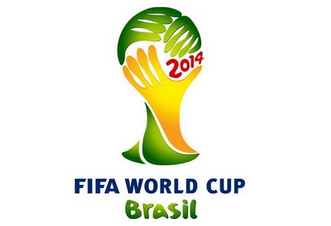
Finally it comes to the year of 2014 and Brazil is the host for the second time. The logo features 3 hands holding up the World Cup trophy colored in green and yellow to signify the Brazilian flag.
Tags: artwork, inspirational idea


