

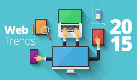
10 Popular Web Design Trends You Should Follow in 2015
Trends in web design change with time. With heavy growth of mobile and tablet usage, web design is transforming to serve these interfaces in a better way. We have seen the changes taking over in 2013 and 2014. Here are 10 trends that you can anticipate to rule 2015 and the years coming ahead.
(Image Source: Eminentseo.com)
1. Blurry Themes
The iOS 7 has inspired many designers to adopt a blurred background in their themes. The settings are of the idea that the previous interface overlays the current interface, just like frosted shower doors that blur the settings. This trend looks really cool and the non-linear gradients that form as a result look really great.
(Image Source: DesignModo)
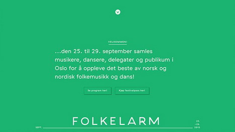
2. Big Hero Areas Instead Of Sliders
This trend is gaining momentum pretty impressively. Big hero areas are replacing the sliders that had been in place for quite a long time. For those who don’t get the term, hero area is a common terminology in print media referring to the intro area on a website’s top having a big image and a little text.
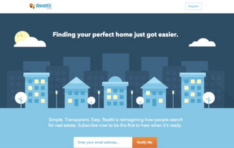
(Image Source: TheNextWeb)
This trend has become pretty popular in the real estate websites where we could previously see several sliders. Elaborate and creative, hero areas are the new way of grabbing attention and soon sliders will be considered old school.
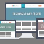
3. Great Emphasis on Mobile
Since responsive web design has become the new rule of the designing arena, websites are becoming more and more mobile friendly. The designers pay great attention now that their sites function full well on mobile devices to keep up with the growing internet browsing through smart phones.
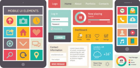
(Image Source: TheNextWeb)
Therefore a few practices that are commonplace now are: integrating websites to social media, encouraging visitors to subscribe for emails, parallax designs, fast site loading time, etc. All these practices have one aim, to make the mobile web experience easier and less frustrating.
4. The Rise of Flat Design: Material Design
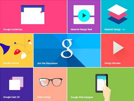
(Image Source: Google Design)
Flat design is yet another trend on its rise for quite some time. The minimalist UI design is developing and evolving into something more favorable for mobile interface, ‘material design’. Material design is basically a result of Google’s set of guidelines for better designing keeping in view the mobile users. It supports better mobile browsing by enhancing the visual and motion experience. In other words, it is almost the same old flat design but with layering, subtle gradients and animation to make the tactile experience worthwhile.
Personally, I see material design as a future of flat design on the whole. This trend is to take over the coming many years as the mobile browsing isn’t expected to go anywhere, anytime soon.
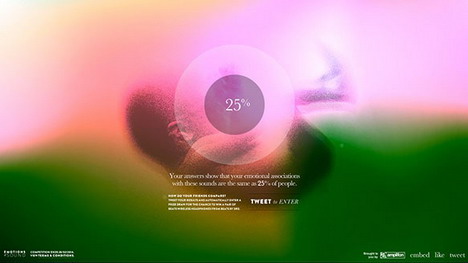
5. Microinteractions
Micro-interaction is a trend being in place recently. It is basically an engagement technique on the web front. We all have seen such Microinteractions on different sites where a small signup box appears in front of a webpage and everything in the background goes fade. As discussed earlier, microinteractions encourage greater user engagement. They liven up a usually static webpage.
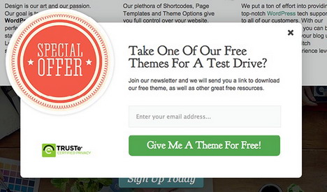
(Image Source: Elegant Themes)
We expect this trend to further continue and develop into new shapes and be used for different purposes. There can be so many types of innovations in the WordPress themes where plugins can be developed to bring new experiences to life. This trend has so much room to evolve into something more than it is right now.
6. Scroll More, Click Less
(Image Source: DesignModo)
Research has shown that users prefer to scroll instead of clicking. That is why are seeing rise in the trend of having single long page sites or sites having multiple long pages. This trend becomes more interesting when storytelling is included in the mix. With more experiments being done with parallax designing, long scrolling pages can be expected to be seen more. We can surely anticipate some really interesting long scrolling sites with their own quirks twists and turns in the upcoming future.
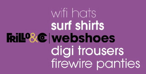
7. Brandable Typography
(Image Source: Tesla Themes)
Typography has developed so much in the past few years. Designers have got a lot inspiration to use fonts as a tool for branding and this is becoming quite a trend in web design. Big and bold use of typography across web pages exudes the independent status of the site. It acts as a brand in itself and sets the website apart, getting a strong message across.
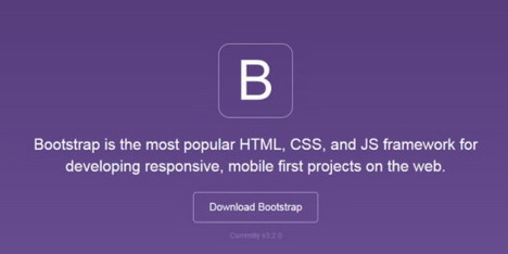
8. The Rise of Bootstrap
(Image Source: OneExtraPixel)
As the trend for developing responsive websites is picking up its roots, Bootstrap is becoming more and more popular. Being one of the best framework to develop mobile oriented responsive sites in CSS, HTML and JavaScript, Bootstrap is on the rise these days and expected to stay so in the coming many years. It has made easy and quick to develop front-end web pages. Like its name, developers of any skill level can work with it for any device interface and any size of projects.
9. Monochromatic Colors
Several variations of a single color make an influential visual impact. Minimal color palettes make the black or white text to become more prominent on the web page.
(Image Source: Jimdo)
We all know that different colors can have different psychological effects on the viewers, therefore it is important to select the color keeping this in mind. A monochrome version of a website can deliver the desired message on a subconscious level to the audience.
10. Videos replacing Text
People prefer watching over reading. They have short attention span. One cool way to produce better results online is integrating videos on the websites and reducing the text. This is an easy way to tell your story quickly and more efficiently. However, adding videos can slow down the loading duration of a web page. So, it is important use videos sensibly. No wonder videos are great in making a lasting impression and explaining complicated topics with great ease.
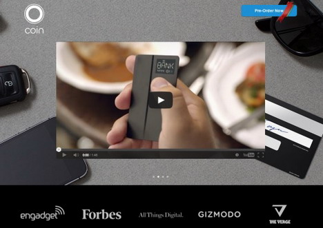
(Image Source: 8waysin8days)
The trends are lately moving in the direction of simplicity. User experience and mobile optimization has been guiding the way. Use caution while using visual effects and keep in mind as to how they will impact on user experience and ultimately driving conversions.

You May Also Like:
 8 Website Design Trends to Follow in 2015 / 2016
 7 Top of the Line Web Design Trends for 2014
 User Experience Design UX: The Worst and the Best
 It Won’t Work! 20 Worst Web Design Fails
 Top 25 Sites to Find Hot Trends and Popular Topics on the Web
 Top Web Development Trends You Need to Checkout in 2013
 What You Can Learn About Website Design from Gaming Websites
 18 Websites to Showcase Your Design and Art Works
Tags: web design resources