User Experience Design UX: The Worst and the Best
This is easily one of the most done-to-death topics in the good old web universe. This question is directed at all practicing web designers and developers or even app developers: How many times has the client or user told you that the UI of the app or front end of the website does not appeal to them? Depending upon your experience, you probably have lost count and that is alright in this case. No one can deny the importance a user friendly interface has on a project be it an app or a website.
The reason why this is being written is because professionals in all degrees have had trouble in nailing down the kind of design they want on their UX and this is equally true for CMS experts like Joomla or WordPress professionals. One trending design is adopted by a thousand different websites and is, quite literally, done to death before another one takes over. So when we talk about the worst practice, we talk about one that continually conforms to whatever is trending. Let us analyze a little better with an example.
(Image Source: Stephenthomas.com)
An Example of the Worst: Following the Trend Decreases Visibility
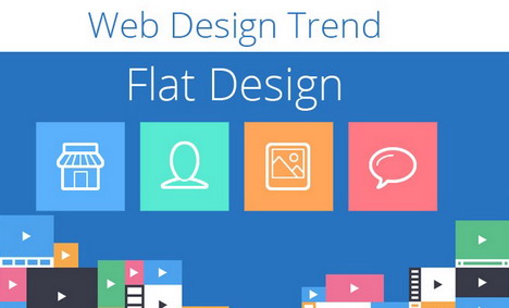
Trends and their ad-hoc adaptation is tacitly the worst enemy of UX and their implementations. HTML transition has always been a little easy with flat designed pages but that is not the entire story behind the success of why flat design is so popular. The gurus of design, aka Apple, are mowing around the web with their themes on flat design.
Literally if ever there was a time that flat design was this much talked about, then I must have been living under a rock. So imagine if everybody jumps on the bandwagon of having flat design done. For one, the sites who already have implemented this might just get a boost but this is marketing dynamics. So if everyone is implementing the flat design, the visitors to each site might not even distinguish between the two or three businesses.
Think about it, if I give you a series of URLs and ask you to go through them in fifteen minutes and then return and tell me about something from their interface; what would be your output. In the most average case, the output will be a summary of the similarities between most of the sites, in fifteen minutes you would detect some of them. But you would also remember a feature or two of a site that stood out more from that list and be able to describe it to me in some detail. That is the point of the worst UX design.
Today, if an interface is having poor user cognition, then it is a bad UX design but if an interface looks unnoticeable or unmemorable then quite frankly, it is falling in the worst UX design. Remember, visibility and recalling matters. If your UX looks like every other interface on Google because it follows what the “best” are doing then your visibility will suffer which means your business or your app or your brand suffers.
What Do We Mean by the Best? Add on, Build on over What the World Adores
In all artistic and creative practices and outputs, the “best” is something interpreted individual by the designer or the designers in question. Cognition, simplicity, appeal are all parts of the equation and these are some fundamental principles when designing the UI. The thing people most tend to forget is that: these things are psychologically backed and the psychic of a human mind is hardly static. The smarter artist can understand this and hence they are not afraid to embellish their own creative flair in projects. Think over it technically, even Apple went big because of understanding the need to stand out, so following their practice to make it big is highly taking the correct lesson out of their success story.
This is by no means to dismiss the standards or the successful trends of designing. The quality exists hence why it achieves success. The proper practice, if you are adopting a trending design practice, is to build upon that design and add bits of your own work to make it stand out. There is no easy way of explaining this; but if you think that flat design achieves simplicity and you want simplicity in your project then take your favorite flat design template and rearrange it.
Rearrange it, add bits to it but produce it in a manner that it remains almost unrecognizable from what it was and yet the principle of simplicity is still there in abundance. That is what creative artistry for business is all about and in the UX world; it can often be the difference between making a mere idea into an audience raking powerhouse.
So what are we saying then?
Ending note? Just remember the most powerful tool that you have at your disposal as the UX designer. Bear in mind that the way you visualize the design will be how your visitors or users interact with the application in question. And these are the basics behind any interaction design. The idea of the “best” UX comes from the applications of those principles but then there has to be some inclusion of your own originality in that design as well. Keep it standard but then build it into something great.
Tags: user experience, user interface, web design resources, web usability


