Top 35 Free Infographics Tools and Data Visualization Software
It is important in our world of data to be able to convey complex information in a format that is interesting and visually appealing. Infographics and data visualization tools help turn raw data into readable, enjoyable charts, graphs, and illustrations for consumers of the information. These tools have become essential in business, education, marketing, and research. The ability to produce beautiful reports, social media graphics, interactive dashboards, or visual presentations has never been easier using free infographic tools and data visualization software.
This article discusses the top 35 free software options rated based on the needs of the user from beginner to advanced. The tools combine templates, templates, handcrafted drag-and-drop editors, AI, and full customization. You can also convey statistics, trends, and complex major ideas with these tools and they have made it easier to convey all topic materials to your audience. Keep reading to find about free options available to improve your visual storytelling!
1. Piktochart

Piktochart is a simple infographic and data visualization tool for people and businesses to create amazing visuals without any design experience. It comes with templates you can customize for reports, presentations, and infographics. It is most suitable for marketers, educators, and anyone working in corporate roles who is not a designer. Piktochart is easy to use because it has drag-and-drop features in the editor, which also has many icons and charts included. This means it is easy to create compelling visuals from many types of data at any level of complexity.
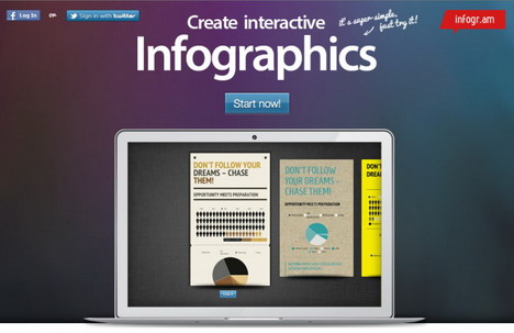
2. Infogram
Infogram is a very helpful online application for infographics, interactive charts, and reports. It has many templates that are already designed, you can integrate live data, and it has an easy drag and drop design method. For organizations, journalists, or educators looking for visualized data, Infogram allows users to connect directly to a Google Sheet and or connect to an API to build visualizations from data sources. Users can easily create infographics that users can either embed or share online.
3. Canva

Canva is a multifaceted design platform that offers access to many infographic templates while making data visualization accessible to users with any level of graphic design background. Utilizing drag-and-drop capabilities, graphic customizations, and access to plenty of free icons and fonts, Canva serves as a great platform to create infographics as well as social media messages or slide presentations. Moreover, Canva has team collaboration and has an easy integration with stock photos and other design elements which makes it an ideal application for professionals or students.
4. Tableau Public
Tableau Public is a free data visualization application. It allows you to create and share interactive charts, graphs, and dashboards. It is particularly useful for data analysts, researchers, and storytellers. Tableau Public has many different options for visualizing your data in a way that makes complex data simple to digest. You can connect to a variety of data sources. You can publish your insights online, where the public can view them and interact with them. Tableau Public is an ideal platform for sharing open data and business intelligence.
5. Visme
Visme provides users with an all-in-one visual content creation tool to create infographics, presentations, reports, and social media graphics. Featuring a vast library of customizable templates, animations, and interactive parts to easily bring your data to life, Visme has a user-friendly interface and allows for collaboration making it an ideal tool for businesses, educators, and marketers wanting to make professional-looking and engaging visual presentations of information.
6. Datawrapper
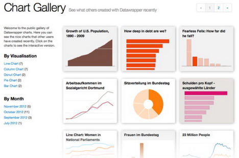
Datawrapper is an easy-to-use data visualization tool that allows anyone to create interactive charts, maps, and tables, without any coding necessary. It is intended for journalists, researchers, and businesses, and allows a variety of chart types including bar, line, and scatter plots. Datawrapper is easy enough to use, it only takes a few minutes to upload your data from CSV, Excel, or Google Sheets. With formatting options and embedding capabilities, it is a great way to create usable, professional, responsive charts and maps that can be disseminated via reports, presentations, and online publications.
7. Venngage
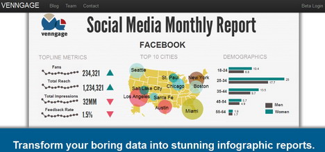
Venngage is an all-in-one infographic maker that allows users to create colorful presentations, reports, and charts. It comes with a ton of templates, icons, and graphics that can be changed to suit the needs of marketers, educators, and businesses. Its simple drag-and-drop template lets users create infographics that are based on or analytics, social media assets, and branding. It supports collaboration between teams and branding, so any branding a business chooses to use and can give them a consistent look on their websites and any paper materials they want to pass out.
8. Google Charts
Google Charts is a free and simple tool for visualizing data, allowing users to create dynamic, interactive charts for use on websites and in web applications. Charts can easily be updated with real-time data, and Google Charts supports a variety of chart types, including line, bar, pie, and geo charts. Google Charts has an easy connection with Google Sheets and any data source, and Google Charts provides a flexible and customizable way for developers and businesses to augment data presentations with visually-engaging and responsive visualizations.
9. Adobe Express
Adobe Express is a simple graphic design tool for designing infographics using quality templates, graphics, and fonts. Marketers, educators, and content creators can all use Adobe Express to design great-looking social media posts, flyers, and presentations. With a drag-and-drop interface and design functionality powered by AI, anyone can create unique high-quality images with no effort! Adobe Express offers collaboration, so sharing and co-editing projects as they are being put together in real-time is easy.
10. D3.js
D3.js (Data-Driven Documents) is a highly flexible JavaScript library for building complex and interactive visualizations of data. It allows developers to bind data and use custom transforms with HTML, SVG, and CSS. D3.js is highly configurable, which is why it is a popular choice for data scientists, analysts, and web developers wanting to create visualizations that are highly dynamic. D3.js does have a steep learning curve and is well-suited toward those who have some coding experience and want complete control over data representation.
11. Microsoft Power BI
Microsoft Power BI is a comprehensive business intelligence solution that allows users to inspect and visualize data with bright, interactive reports and dashboards. Power BI connects to data from multiple data sources, including applications such as Excel, SQL, and cloud sources, and uses real-time and AI-enabled analytics. Power BI also has an easy to use a drag-and-drop interface that allows users to assess trends, create reports, and make informed decisions for the organization. Often used due to its collaborative features, it also makes for a popular enterprise reporting, a financial analysis, and a performance tracking tool.
12. Snappa
Snappa is an easy-to-use online design tool focused on making beautiful graphics like infographics, social media graphics, and marketing graphics. There is an extensive library of templates, stock photos, and editable graphics that make creating great designs simple, even for beginners. Drag-and-drop editing is simple and built-in resize capacities make resizing graphics for different platforms easy. Marketers, bloggers, and businesses will find Snappa to be an easy way to design professional graphics without needing to be a skilled graphic designer.
13. Easelly
Easelly is a tool for making infographics that has the unique power to help individuals turn a lot of complex data into quick, easy, and beautiful graphics. Easelly has many thoughtful pre-made templates, icons, and charts that make it easy and quick for the user to build their infographic for reports, presentations, or social media. It’s easy for beginners or experts in infographics to create infographics using a simple drag-and-drop interface. Easelly allows educators, for business, or for marketing to tell stories through visualized data, which makes it better for communication to a more diverse audience.
14. Mind the Graph
Mind the Graph is a tool for infographic and visualization specifically designed for professionals in scientific and academic communities. Mind the Graph provides a unique library of scientifically accurate illustrations and templates to help you create visually appealing research posters, presentations and publications. Mind the Graph provides researchers with an easy to use drag-and-drop process to transform complex scientific data and research into engaging and understandable visual representations. Mind the Graph is a great option for anyone involved in research communication – scientists, teachers, educators and students – to create high-quality, science-related infographics for communicating their research.
15. RAWGraphs
RAWGraphs is a free, open-source tools for data visualization that was created for people to take complex data sets and convert them into graphics that become transparent and meaningful. RAWGraphs accepts a number of types of data and allows users to create unique and customizable visualization type charts without knowing code. RAWGraphs is beneficial for designers, journalists, and researchers to create graphics that tell a story, bridging the gap between spreadsheets and design software, and creating meaningful, interactive, informed charts. Because it is open-source and flexible, it becomes a tool that can be used as part of a data story or presentation.
16. Animaker
Animaker is a web-based animated video and infographic software that enables people to create animated videos and visual objects. In conjunction with an extensive library of templates, characters, and motion graphics, Animaker is a great choice for marketers, educators, and businesses who want to create use animated content to illustrate complex concepts. Animaker is a drag-and-drop application, and its user-friendly interface makes it possible for people, with little to no technical knowledge to create animated infographics, explainer videos, and presentations.
17. BeFunky
BeFunky is a full-service design and photo editing website, including a user-friendly infographic maker. BeFunky has an impressive selection of templates, icons and graphics that allow users to create a stunning infographic with ease. The drag-and-drop design interface makes it possible for anyone from marketers to educators to design an infographic. Besides their infographic maker, BeFunky offers a photo editor that goes beyond basic editing tools, making it possible to create any contextualized and engaging content in one shared location regardless of your profession or goal.
18. ChartBlocks
ChartBlocks is a robust online tool for chart creation that offers the ability to create beautiful charts for data visualization without the need to code it. In addition to its ability to pull data from spreadsheets and databases, ChartBlocks will pull data from live feeds too, and it can customize styles for your charts. The charts are responsive, can be printed, and can be embedded into websites or social media. ChartBlocks allows users to develop responsive, customized charts using a simple drag and drop interface, and users can create charts for presentations, reports, and dashboards. ChartBlocks is a great resource for a business, educator or researcher that wants to create dynamic data visualization.
19. Flourish Studio
Flourish Studio is a pioneering data visualization platform that assists users in producing interactive graphs, maps, and presentations. Flourish’s interface is simple and enables straightforward modification and incorporation of data from live sources. Flourish allows for a variety of visualization types, including animated graphs and storytelling dashboards. Flourish is widely utilized by journalists, educators, and businesses to produce engaging content from data. Flourish enables the creation of shareable and embeddable visualizations of the data to help make data findings more actionable and engaging.
20. Vizzlo
Vizzlo is a multifaceted data visualization utility which streamlines the creation of charts, diagrams and infographics. Supplying a robust pane of templates, users can quickly produce professional quality images ready for reports, presentations or social media. Vizzlo has simple integrations with PowerPoint, Google Slides, and other tools to enhance the workflow capacity. The tool even supports real-time collaboration, making it a go-to solution for teams. Vizzlo will help take complex data and simplify it into coherent, attractive and visual pieces of graphics for business intelligence, marketing, or research purposes.
21. Google Looker Studio
Google Looker Studio (previously Google Data Studio) is a free and cloud-based data visualization and reporting platform. It allows users to build interactive dashboards and blend data from several sources, such as Google Analytics, BigQuery, and 3rd party applications. Looker Studio includes customizable charts, graphs and filters for your data story structure. With its easy-to-use drag-and-drop editor and real-time collaboration features, Looker Studio is a great option for businesses, marketers and analysts looking to convert raw data into insights.
22. Biteable
Biteable is a straightforward web-based video maker enabling its users to create captivating animated infographics, presentations, and explainer videos. It includes a sizable catalog of templates, animations, and stock footage to facilitate content creation. Biteable is great for businesses, educators, and marketers that require a data presentation that engages their audience. With the simple drag-and-drop editor, users can create professional-quality videos in no time, regardless of their editing experience. This is an ideal tool for social media marketing, internal comms, or any storytelling with data.
23. Creately
Creately is an online collaborative diagramming and visualization tool that enables you to quickly create flowcharts, mind maps, org charts, and infographics. With access to a large template library and the ability to collaborate with your team in real-time, it is perfect for brainstorming, planning projects, or displaying data visually. A drag-and-drop interface and integration with popular tools, such as Google Drive, Confluence, and others, only enhance its usability. Creately is in use by many businesses, educators, and designers to help them convey complex ideas in an engaging and formatted fashion.
24. Databox
Databox is strong business intelligence and dashboarding software that enables users to monitor, visualize and analyze data from a variety of sources in realtime. It features a customizable interface that allows businesses to create interactive dashboards with zero coding experience. Databox provides integration with over 70 data sources, including Google Analytics, HubSpot, and Salesforce, to plan and monitor performance. The user-friendly mobile application helps ensure data is usable any time, so marketing, sales and executive teams can do their jobs quickly and based on data.
25. Plotly
Plotly is a leading data visualization platform that allows users to build interactive and quality graphs, charts, and dashboards. It is available in Python, R, and Javascript making it popular among data scientists, engineers and analysts. Plotly’s Dash framework makes it easy to build analytic apps for the web. Plotly is open-source and Enterprise, and it is widely used to create professional visualizations in a variety of industries including finance, healthcare and research. Overall, it is an easy way to create impactful, publishing-quality data visualizations.
26. Visual Paradigm Online
Visual Paradigm Online is a flexible diagram and design tool used for flowcharts, mind maps, infographics, UML diagrams, and more. It has a straightforward interface and drag-and-drop capabilities anytime, anywhere, regardless of experience level. It comes preloaded with a ton of templates, collaboration, and exporting capabilities that make it perfect for business process modeling, system design, and data visualization. It’s cloud-based, easy-to-use, and allows teams in different locations to work seamlessly and collaborate with real-time updates using their device of choice.
27. Lucidchart
Lucidchart is a simple and easy-to-use cloud-based tool for diagramming software that aids in visual collaboration. It helps users create flowcharts, wireframes, org charts, and all types of data-driven diagrams. With real-time editing, team members can work together easily. Additionally, Lucidchart integrates with Google Workspace, Microsoft 365, and Slack as a work management tool. It not only includes smart shapes and automation but is also great at data linking, which is the reason the software is very popular with businesses, educators, and developers to simplify their processes or visually present complex data.
28. MindMeister
MindMeister is a web-based mind mapping application developed specifically for users and teams to brainstorm and visualize thinking, plan, and organize their ideas more effectively. MindMeister has an attractive, rich interface that is simple and easy to use; it even offers real-time collaboration, task management, and presentation mode. Users can create colorful and interactive mind maps, attach notes, and connect or integrate with productivity tools, like MeisterTask. MindMeister is a useful tool for educational, creative, and project planning tasks. Users can develop mind maps to structure their thoughts and become more productive.
29. Cacoo
Cacoo is an online diagramming tool specifically designed for teams to work together seamlessly. Cacoo also provides a large library of templates for flow charts, wireframes, network diagrams, and many other diagram types. All users can edit online with real-time sharing, leave comments, and integrate with compatible applications such as Google Drive and Slack. With its ease of use and cloud capability, Cacoo can be a great solution for project planning, brainstorming, and process visualization for all types of professionals.
30. Gliffy
Gliffy is an excellent online diagramming tool that enables users to create flow charts, mind maps, network diagrams, etc. Its drag-and-drop interface and real-time collaboration allow you to create visuals on a professional level with little effort. Additionally, Gliffy can be integrated with popular platforms such as Confluence and Jira, making it ideal for teams who are managing workflows. The tool has extensive shape libraries and additional customization options, and users can build and share appealing diagrams much faster than typical and/or paper-based methods. This leads to using modern visuals to help simplify complex ideas.
31. DesignCap
DesignCap is an infographic and poster creation tool that is easy to use and has a large number of templates, icons, and elements to create beautiful graphics and visual graphics. It is best suited for marketers, teachers, and business professionals, who can use the online tool to design everything from presentations and reports to social media and marketing graphics. The drag-and-drop editor doesn’t require any design experience. Store your creations in the cloud and share with your audience designed infographics in minutes – they will look great on social media posts, websites, and marketing campaigns.
32. Xmind
Xmind is one of the top mind mapping and brainstorming tools available for boosting creativity and productivity. It has a wide range of templates such as fishbone diagrams, tree charts, and org charts to help users visualize their elaborate thoughts and ideas. It provides easy cross-platform synchronization so users can work across devices. Thanks to fresh and modern themes, options to export work, and a user-friendly, and distraction-free interface, it’s useful for individuals and teams needed to visually organize and facilitate thoughts, data etc. in their process.
33. EdrawMax
EdrawMax is a comprehensive diagramming tool that allows users to make flowcharts, organizational charts, mind maps, floor plans, and more. It has thousands of templates and a significant library of symbols that could ease the visual content creation process. EdrawMax also has cloud collaboration that allows for teams to work in real time with one another. It is compatible with different file formats such as Visio, PDF, and Office while also an excellent option for a range of professionals across various industries.
34. Prezi
Prezi is a flexible presentation and data visualization tool that goes beyond a traditional slideshow. Prezi has a zooming interface, to create a stimulating, non-linear, storytelling style presentation. Prezi uses the cloud, allowing presentation materials to be shared with and collaborated on in real-time, on any device, like a laptop, tablet, or mobile phone. Also with animated transitions, interactive visuals, and customizable templates, Prezi is a great way for the user, to create and present an engaging presentation that holds the audiences attention. Prezi continues to be a popular choice among educators, marketers, and business people, offering a interesting form of visual storytelling for the audience.
35. Genially
Genially is a software that allows users to create interactive content for presentations, infographics, gamification, and data visualization. It also has a lengthy list of templates and animations users can use to create interactive and engaging visuals without having to code. It is a perfect tool for educators, marketers, and businesses. Genially enables you to create dynamic and interactive content to enhance the story and engage users. Genially also has very good cloud-based collaborative features that make it a good software for teams looking to create visually appealing and interactive content for presentations.
36. Draw.io
Draw.io is a free, open-source web-based diagramming tool that is an excellent solution to build flowcharts, network diagrams, mind maps, etc. The tool uses an easy drag-and-drop interface, integrates nicely with cloud-based solutions like Google Drive, One Drive, and Confluence, and offers numerous templates and configurability which makes it a great visualization partner for individuals and teams seeking authentic complexity, yet simple to use. Draw.io can be used in offline mode, has strong privacy advantages (not profiting from user data) and is therefore suggested for professional use.
You May Also Like:
 20 Data Visualization Tools to Better Understand Data
 Top 30 Tools to Create Your Own Infographics
 30 Best Free Online Tools to Create Chart, Graph & Diagram
 Top 30 Best Free Flowchart & Diagram Tools, Software
 10 Best Free Interior Design Online Tools and Software
 20 Best Free Online Tools to Create Magazine Covers
 Best 40 Free 3D Modeling Web Tools & Software (2025)
 Top 20 Online Tools to Create Map for Free
Tags: chart & graph, infographic, utility software, web app