20 Data Visualization Tools to Better Understand Data
Today data can be practically seen concentrated in almost every other thing in our daily lives, ranging from the small labels on food items to critical performance reports pertaining to different industries. As a consequence, it is becoming increasingly complicated for designers worldwide to display data is a way that stands distinctly from the rest of the data streams in the competition.

Given the increasing trend of employing data visualization to attract attention to key elements in a message, there are a number of free graphic design software that can be found online to help you with the work. In order to realize how creatively you can display different types of data, there are some brilliant data visualization tools that are up to the job of providing amazing results.
1. Plotly
The software allows you to make interactive presentations, charts, and dashboards. It provides different options for importing data and user can perform analysis using Python, Jupiter, Excel, R, MATLAB, etc.The online chart development tools and the visualization library helps the user in creating some fantastic graphics.
2. DataHero
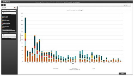
With DataHero users can catch data from cloud service and create charts and dashboards. Without requiring any technical knowhow, this is a great tool for beginners with the convenience of getting started through some quite interesting features.
3. Chart.js
Despite being equipped with only 6 chart types, Chart.js is an open source library that offers amazing visualization tools and is ideally used for small projects. The software uses HTML5 canvas attributes to render charts, create responsive, flat designs and is quickly becoming one of the most sought-after open source charting libraries.
4. D3.js
A JavaScript library that acquires SVG, CSS, and HTML to render some aesthetically pleasing charts and diagrams from different data sources. D3.js, one of the most powerful tools among many others in the market have the tendency to fabricate some highly advanced outputs with complicated datasets. The tool is open source and easily accessible due to its usage of web standards. Further, the software is also incorporated with a seamless user interaction support.
5. Tableau
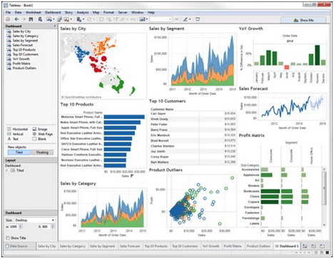
Tableau is a free, popular visualization software that is nicely congested with maps, charts, and graphs.Users can simply drag and drop data in the tool and can update in real time. Furthermore, the user can communicate with other team members to incorporate quick changes in the project.
6. WolframAlpha
As termed as a ‘computational knowledge engine’, WolframAlpha is a potential rival of Google and performs some intelligent functions such as displaying charts with respective to data queries without calling in any configuration. The tools also provides an easy widget builder that enables the user to transport visualizations on your website.
7. Raw
Raw is an open source, free, and customizable tool that assist users in creating vector-oriented visualizations. The tool also facilitates data uploading from apps to computer in a safe manner, and can also be exported as a PNG or SVG and embedded in the webpage.
8. Dygraphs
An efficient, flexible and open source JavaScript charting library, Dygraphsallows the users to examine and interpret congested data sets.The tool is highly customizable, compatible with all major browsers, and also acquires the ability of getting zoomed on several mobile phones and tablets.
9. ZingChart
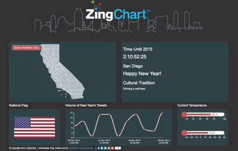
The software is a JavaScript charting library and feature-filled API that encourages the user to create interactive flash or HTML5 charts. ZingChart is equipped with 100 plus chart types to cater your data needs.
10. InstantAtlas
InstantAtlas is one of the best choices if you are searching for a visualization tool with mapping. This powerful software facilitates the user in creating highly interactive and dynamic profile reports. The features mix statistics and map data to display exciting visualizations.
11. FusionCharts
FusionCharts Suite XT is a powerful tool that promises you over 90 gauges and charts, 965 data-centric maps, and by-default available business demos and dashboards. The software is equipped with a vast JavaScript API that makes it convenient to integrate it with any JavaScript framework or AJAX application. These plethora of dashboards, maps and charts arrive hugely interactive, customizable and aren’t platform or device dependent having the tendency to run fluently across all.
12. Timeline
The tool is an amazing midget that renders a brilliantly interactive timeline and responds to the navigation of mouse. Timeline is convenient in developing advanced timelines that are capable of displaying a plethora of loaded information within a limited space. Each element in the tool can be clicked to expel a detailed information.
13. Exhibit
Being a fully open source tool and product of MIT, Exhibit is best known to create highly interactive maps, and other data-centric visualizations that are primarily focused towards teaching or historical-oriented data sets, for instance, birth places of famous people, flags associated with countries.
14. Modest Maps
Modest Maps is a small scale, simple mapping software that designers use as a visualization tool to integrate and create interactive maps within the website. The API is easy to grasp and provides a healthy number of hooks for incorporating your own interaction code.This makes it an attractive choice for designers who want to customize the user experience as per the aesthetics and essence of the website and app.The core library can further be extended through additional plugins that strengthen its basic functionality along with providing few very useful data integration options.
15. Leaflet
A mapping tool that provides easy usage of OpenStreetMapand integrates totally interactive data visualization in a CSS3/HTML5 wrapper.Leaflet is equipped with a small core library, but offers a plethora of plugins that can enhance the functionality through animated markers, heatmaps, and masks. The tool comes ideal for any project requiring data to get displayed on a geographical visual.
16. Visual.ly
A tool incorporated with a combined gallery and infographic generation features provides a simple set for creating amazing data representations, along with a platform to share your outputs. The expertise of this tool goes beyond the scope of data visualization. But if a user requires something independent, Visual.ly is a great platform for all the info-enthusiasts out there.
17. Visualize Free
Visualize free, a hosted tool that provides the freedom to the user to use publicly available datasets, or rather upload your own, and create interactive visualizations for data illustration.The service is totally free and the output extends well beyond the basic charts.The development job requires Flash and the visualization can be created through HTML5.
Interestingly as the name suggests, the tool is primed to make the world a better place. The tool works to display pretty amazing and comforting visualizations of distressing and critical data. For example, the user can create visualizations pertaining to the statistics of child abuse, African famines, global poverty, etc. Even though you are restricted to upload your own data, but a richly interactive visualization is guaranteed.
19. jqPlot
The tool is a jQuery plugin and is a sensible choice for creating point and line charts. The user also gets to experience additional features including how to create trend lines automatically, and interactive points that can be altered by an online visitor, hence updating the dataset in the process.
Being a great library incorporated with a modular structure, the tool allows you to mandate visitors for downloading what’s literally relevant to showcase your data visualizations. The library offers a plethora of swish animation effects and distinct styles.

You May Also Like:
 Top 35 Free Infographics Tools and Data Visualization Software
 30 Best Free Online Tools to Create Chart, Graph & Diagram
 Top 30 Tools to Create Your Own Infographics
 Top 20 Online Tools to Create Map for Free
 15 Reddit User and Data Analytic Tools
 15 Professional Data Recovery Tools for Windows
 Top 30 Best Free Flowchart & Diagram Tools, Software
 37 Best Wireframing, Prototyping and Mockup Tools for Web Design
Tags: chart & graph, database, graphic design resources, infographic, web analytic, web app