

Breaking the Buzzword: What is a ‘Responsive’ Website and Why Does It Matter?
The responsive website trend is taking the world by storm these days as the latest trend and it looks like it’s going to be here to stay. It’s not quite so widespread that it’s made it into the popular subconscious yet, but it probably will at some point. The point is, it’s a topic worth looking at in more detail to see what it means and whether it’s a guideline that’s worth using for your own site. Here are some of the ups and downs of the approach.
The History of Responsive Web Design
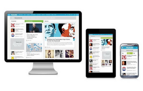
Responsive web design is a phenomenon that was born in the age of mobile cellphones. In the old days, you really only needed one site for all devices, since most devices worked the same way more or less in how they depicted websites on the screen. Everyone was basically using the same screens. But now, there are many different sizes and types when it comes to mobile devices. Not all screens will depict websites in the same way, because each device works differently, and is a different size. Some need to support viewing sites in more than one way, for example. Some might be just a few inches across like in a traditional mobile phone. Others might be much larger such as with tablets like the iPad. And some might be even larger still such as with hybrid PCs all the way up to a more traditional PC desktop setup.
Adaptive vs. Responsive
The difficulty that needed to be addressed concerns how websites should display pages for so many different devices. What will look good on a PC screen may look completely terrible on a screen that’s only a few inches in length. One approach to this problem typically has been to go with an “adaptive layout” approach. Adaptive layout means that there are multiple set layouts with a fixed width. Each pre-set has to fit a wide range of devices. So if a device is a certain size, than it might get one fixed layout, if it’s another size it might get a second. The problem is that lack of conformity in making devices means that some of the presets might not be a terribly good fit for any particular device. Responsive web design means that there’s a fluid grid layout that will respond directly to the device that connects to it. The site itself can change around to meet a certain style and layout appearance based on what device is being used. This is why it’s called “responsive.”
Pro-Time and Money Benefit
One of the benefits of responsive design is that you don’t need to create more than one website. This is often needed if you don’t use the responsive approach. You’ll have to create one website for regular PC users, another for a particular type of mobile user, and so on. Completely reinventing the wheel over and over again can be a huge waste. It can take a lot of time and effort to do this and it’s not necessary if you just have a responsive style.
Con-Technical Issues
The responsive craze is still really new so there can still be some issues associated with it. This is one downside to using it right now. You may have trouble getting it to work and the support for it can be subpar since there’s been no time for the technical community to get a lot of experience with what can go wrong yet. But, given time the technique is sure to become more mature and the kinks are sure to be ironed out.
Pro-New Devices
Another upside to responsive design is that you don’t have to continually micromanage for new devices. This is something a lot of other website designers will have to worry about constantly. Every time a popular new device comes out, there will inevitably a tidal wave of complaints from people using the new device and visiting a site that doesn’t display very well. But with responsive design, you don’t have to worry about this as much. You won’t have to redesign your site every time something new hits the market since your site will already adapt to new devices automatically as part of its operation.
Con-Loading Time
One problem with going to build your own website with responsive web design is the load time of pages. Often, images are scaled down instead of just going through resizing. While this can make the site look a lot better on any device, it can also mean that the site takes a lot longer to load in the first place. This is especially the case if you have a lot of images and video on your site. This is always going to take longer to load, but modern cable internet rates usually mean that the difference isn’t really noticeable. But with responsive design the extra time for communication could mean that the delay is noticeable, especially if someone is using a slower connection like throttled 3G.
Pro-Tracking is Easier
Trying to track multiple websites all at the same time when all the sites have the same content but just different displays can be a massive headache. This isn’t a problem with responsive design because you have just the one site for everything. You can track just one set of analytics and you won’t get all confused by trying to add up numbers from 4 different sites that really don’t have any major difference from each other.
Con-Finding an Expert
Actually finding someone to do the responsive design for you can be tricky since the service is so new. This means it might take extra effort and time to find someone who knows how to do it in the first place. But considering the resources you’ll save in other ways, this will often be well worth the difficulty.
Overall, responsive web design is looking more and more like it will be the way of the future. This is because innovation when it comes to mobile device creation probably isn’t going to slow down any time soon. Recently, even Google has endorsed the practice, marking its movement towards the main stream.

You May Also Like:
 The Best User Interface Design in a Responsive World
 5 Tips for Taking Your Company Website Mobile and Creating Apps
 8 Best Web Services to Convert Website and Blog for Mobile Phones
 How to Increase E-Commerce Website Operability
 8 Check Points Why Your Website Needs to be Redesigned
 How Online Banking Sites Mastered Their Web Design
 Top 10 Ways to Increase Your Website or Blog Traffic for Free
 8 Website Design Trends to Follow in 2015 / 2016
Tags: tips & tricks, web design resources, web development resources