8 Serious Web Design Mistakes You Must Avoid
What gives an indication of the web design as a good or bad? It is true that it is a subjective opinion, preferences of a particular person. But ultimately good design conveys the essence of the message, support interest and clearly visualizes the broadcasted information. Bad design, in turn, makes the message legible difficult, thereby complicating communication.
I give eight common mistakes in the web design of visual communication and how to avoid them. These tips are useful to develop a corporate website, ecommerce website or business website.
1. Perfect Symmetry

Balance – one of the fundamental principles of web design, which is used for the distribution of elements on the layout, creating a sense of order and balance. Balance is the achievement of optical and psychological balance in the composition. However, the balance does not always imply the use of strict symmetry. But at the same time symmetry is not necessarily bad taste – it’s fast, simple and banal way to transmit information. Using the same asymmetry can cause spontaneous interest and other emotions in the subject information. As a result -intensify attention and targeted treatment of the client to resource.
2. It is Not Enough White Space
The space – another of the basic principles used in the web design. It says a thoughtful placement of related elements of their visual grouping together – it helps us to relate the information and understand the logic of the relationship of elements. For this purpose is the use of designers and White (negative) space. So we allow the audience to quickly scan the page without any additional visual elements such as separators.
A common mistake in the web design – it is scattered all over the page content, thus making it look cluttered and messy. This is not conducive to effectively communicate information to the consumer.
So, improve the white space, the ability to let the titles, captions, paragraphs and other elements on the page to “breathe.” White space creates contrast, accompanies the viewer’s eye in the desired direction, sets a neat visual hierarchy.
3. Insufficient Repeatability
Repetition gives a sense of coherence and consistency, and also improves the readability of content. If the project does not duplicate the visual elements – for example, the color scheme, shapes, fonts, images, spatial relations – the site loses its integrity and readers will not be able to link the information blocks.

But to avoid repeating elements of satiety page, otherwise it is likely to tire the audience and cause her annoyance.
4. Centering Text
By the following common mistakes include inappropriate use of leveling a large amount of text in the middle. Center Alignment applies to posters, invitations, branding, allowing to balance the small text, highlight certain aspects of the layout and create a visual hierarchy.
If a paragraph contains more than three lines, this technique creates the impression of carelessness and clumsiness, reduced the readability of content as text strings effect are adjusted boundaries makes it difficult to transition from the end of one line to the beginning of the next. Thus, users have to try and gazed into a paragraph.
It should be applied to large blocks of text aligned to the left or to the right. In the case of web design technique centering the text is best left to headlines and short signatures citations.
5. Too Much Text on the Same Line
Reading large amounts of text, formed in a plurality of long lines cause eye fatigue. The content is much easier to read and digest if it is organized in compliance with the optimal length of the string. The latter depends on the indentation, font size and type. Usually a person comfortably read the text, the length of lines is 10 cm, which is equal to 45-70 characters, including spaces, with the font size of 11-13 pixels.
6. Unsuccessful Kerning
Kern – is controlled change in the distance between pairs of adjacent characters. The text is dependent on the determination of the correct distance between letters and symbols on the proportions of the selected font.
If letters are too close to each other, this gives the impression that the label stuck together. If the distance between them is too great – the inscription is falling apart into individual characters. In both cases, the task of creating accurate and easy to read text can’t be solved. If the purpose of the text is not an effect of accidents, and comfortable reading, you should create a harmonic uniformity kerning text to the web design to look nice and visually organized.
7. Search of Fonts and Colors
Contrast – this is an important and weighty in the web design rule to maintain the equilibrium of the composite layout. The user is experiencing emotional impression, noting the unusual design points, contrast adds focus and does not allow the design looked dull and flat.
To isolate the broadcast messages can be selected and varied variety of colors, fonts, textures, sizes and shapes – the main thing is not to overdo it.
For example, the last thing I would like to see on the landing page or brochure – a jumble of fonts. It not only destroys the layout design and looks disgusting, but also does not allow to focus on content. Experiments with a choice of font should be limited to 2-3 headsets perfect balance with the design of a specific project.
The same is true for the selection of colors: the excess of colors creates an impression of shouting, depressing and cheap bad taste. Limited to 2-4 colors, and always consider the legibility of text on the selected color.
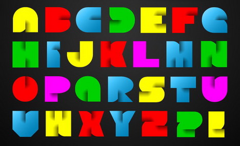
8. Using Bitmaps
Raster – a grid of pixels, these are typical file formats: jpg / jpeg, tiff, gif, bmp, and png. They depend on the resolution, therefore, increasing the bitmap, it becomes jagged and blurry. In turn, vector objects scalable and can be increased without loss in image quality, their lines will remain crisp and sharp on the screen and printed.
Finally,
Without a well-thought-out design excellent idea loses a chance to be seen, heard, perceived. Consider the tips in this article to create a web site and you will achieve the loyalty and love of users to your site. The above common mistakes and recommendations how to avoid them, as well as further independent searching listed on eight counts allow to create professional performance models in which content will look attractive and efficient broadcast message to the target audience.

You May Also Like:
 10 Common Web Designing Mistakes to Avoid
 Understanding the Role of Graphics in Web Design
 14 Common Blog Design Blunders You Can Avoid
 14 Dummy Text Generators to Create Filler Text for Your Web Design Prototype
 How to Strike First Impression in Web Design
 It Won’t Work! 20 Worst Web Design Fails
 Common Email Marketing Mistakes & How to Avoid Them
 Wireframe Forms A Pivotal Part Of The Web Design Category With Other Uses Too
Tags: tips & tricks, web design resources, web development resources