30 UX Design Tips to Ensure Positive e-Commerce Experience
Ecommerce changed our lives, changed the way we buy things. In e-commerce, first impressions are critical for online stores, because the competition is high and it it extremely easy to lose the client, just with 1 click, your client may quit your page and never come back because of the poor user experience. You need to think about value proposition, about how to simplify life of your users and make them buy from you over and over again. You need to think about how to share that your company is different from the hundreds of others online stores. Combined with simplicity, easy user flow and call to action items, you create online experience for your clients.
Let’s look at our ux design tips to boost your e-commerce.
1. Rule number 1 in e-commerce – show high quality images of your product.
2. Keep your shoppers focused. Ensure your main menu, cross sells or upsells etc, doesn’t distract your shoppers from completing the checkout. Use visual queues like color or arrows to focus attention on a single call to action.
3. Your homepage needs to be worked the most. For example, many companies stick to inspiring videos and stories that represent exactly the type of their target. Don’t forget to feature testimonials, ratings and reviews. Use simple, uncluttered design. Use as few words as possible, eliminating everything that does not make an impact, for example, your recent blog posts.
4. Top ecommerce shops generally offer collections of items to guide user tendencies, for example, they may feature a grid with all of the most popular women’s skirts, or they may offer recommended products based on past customer experiences.
5. Data validation. Don’t wait until the user submits the form, validate and notify the user in real-time if there are some errors or missing fields that should be filled in. Real-time inline validation will help your customers complete the checkout quickly with less effort and fewer errors. Make sure the notification is visible enough that the user doesn’t skip it.
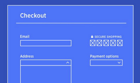
6. Organization of checkout form. Breakdown the checkout page into sections and keep the related items in close proximity. And avoid asking unnecessary information. Single page checkout is meant to be quick and easy. So, avoid asking unnecessary information. Also, don’t make your shoppers guess how many steps it takes to complete the checkout, keep them informed.
7. Shipping and billing addresses are the same for majority of the orders, so pre-fill the billing address details with shipping address instead of asking the user to do this job. Show the zip code field and hide city and state. When the user inputs the zip code, expand the form with pre-filled city and state fields. Ensure these fields are editable. It is easier and faster for your users.
8. Payment security. As always there are a lot of concerns about security in e-commerce. Reassure your shoppers that their data is safe by displaying your security credentials, customer care number and link to privacy policy.
9. You can reduce cart abandonment by creating urgency. Specify the number of units still available in stock if there are only few left. Or if you offer a deal or discounts on the products added to cart and that it ends in a day or two, show it.
10. If you offer free shipping or discount on orders above a certain amount, then you should remind your shoppers of how much more they need to spend to get that offer.
11. When possible add a gift wrapping option to purchases on your store and allow buyers to add a personal note to their gifts. Also, let the shopper choose whether or not to include the price information in the invoice during delivery.
12. User’s wishlist. A shopping cart that remembers you. If an user feels that they cannot afford the total cost of their order, they might remove a few items from the cart. Provide an option to save or move those products to a wishlist so that they don’t lose track of it. You could also remind them of the products in the wishlist the next time one of them is on the cart page. Also, when a user wants ti remove the items from the cart, name it remove instead of delete. And allow the user to set the quantity to zero to remove an item from cart. Once the user clicks the remove link, instead of removing the item immediately ask if the click was intentional. Don’t forget that you should give an option to do these changes on the cart page itself without having to navigate to the product page. And of course, when a shopper adds an item to their cart don’t make them guess whether the item has been added or not, provide a confirmation message. You can either provide the confirmation message on the same page or redirect them to the cart page. When you keep the shopper on the same page, provide product recommendations along with the confirmation message so that they can buy more.
13. Sharable wishlists. Many customers don’t make a purchase decision right away, they need time to think everything over, compare prices with different ecommerce stores or consult their choices with family or friends. Of course they can bookmark the pages, but it’s not as convenient as having all the items stored in one place. The possibility to mark potentially interesting products and add them to wishlist is a great solution. If a wishlist is to be truly user-friendly make sure that the customer can share it with others online. Not only provide an email and social media share, but also enable customers to create a sharable link. Such a link will make it easier for customers to consult the purchase with others.
14. Show recently bought products. Probably you have a bunch of regular customers who often buy the same products in your ecommerce store, then personalizing their accounts is a good idea. If some customer visits you every month to buy a given cat food, displaying a section with recently bought products right after logging, will make their shopping easier. No time wasted on looking for the right bag size and type of the cat treat , just one click and the product is in the cart. Knowing that such feature is waiting for them in your store, will make them more likely to come back.
15. Make the shopping cart always visible. More advanced online shoppers will not want to be sent straight to the basket page if they add an item. Therefore it is important that the basket is visible on every page of the site with number of things added and the price.
16. Navigation is critical when you have a lot of categories, variable products or products with many options. The quicker people can find what they want, the quicker you can move them through to the checkout process. Limit top menu to 7 choices. Use a multi column menu that organizes categories and sub categories. Don’t forget about hidden menus. Over the last few years minimalism has continued to be one of the most consistent web design trends, focussing on clean, simple and easy to navigate aesthetics and giving prominence to imagery and large backgrounds. Many designers believe that the hamburger icon has achieved universal status and brands should no longer be afraid to hide their navigation as users associate the icon with being a menu or list and will interact with it.
17. SEO. Use breadcrumbs to help users navigate and distribute pagerank to your category pages. Use the most relevant, lowest difficulty keywords in your page title, url, headings and across the description text. Provide a short product summary at the top of the page or next to the photo. Think mobile first, now e-commerce depends on mobile as well. The minimum you can do is to have your site responsive.
18. Number of products. Show the number of pages before and after the product listings.Show the total number of products within that category.
19. Filters. Allow users to sort by: price, category, gender, color, etc.
20. Offer the zoom option to let users see details for themselves.
21. Personalization of everything.
22. Money vs value. Some users focus on spending a specific amount of money. Others focus on value. Your site can help address both issues. Do you offer free shipping? Is the price higher, but the quality is superior? State this clear on your site, show your competitive advantage, benefits you may give to your clients.
23. Efficient Search. One idea is to have your site automatically save the spot where the user was the last time they searched. For instance, let’s say your user narrowed down a search to four pages 30 items per page. And he was interrupted while looking at the second item of the second row on page 3. So basically, you would give an option to your users to continue where he left off instead of starting all over again.
24. Newsletter form. Building up a strong email list is a long process, but incredibly valuable for promotion especially around holidays. Having a newsletter sign up form is standard on any ecommerce store, so try to make yours more appealing than others.
25. Do not forget to update your content. Last month’s promos should not be on any of your pages. It is annoying to find promos that you will not be able to use.
26. Emphasize the benefits of having an account. Benefits such as exclusive discounts and promotions are enough to number of shoppers to create an account.
27. Don’t forget about how people read and scan information. Put the important parts of each web page across the top and down the left-hand side. Visitors scan web pages in an “F” pattern, it is a well known fact. So draw their attention with a strong headlines and layout pages accordingly.
28. Offer virtual assistance. Ecommerce companies use chat bots or live chat tools with predictive technology to anticipate shoppers’ needs and provide guidance during the moments that matter most. For example, if a customer is receiving an error message at checkout, or searching for a sizing guide, an intelligent chat bot can deliver timely, relevant assistance. Also they can give personalised recommendations according to user’s preferences.
29. Card design. The card design trend has become more and more popular for the simple reason that it allows huge amounts of content to be organized with little effort. It’s called card design because of the card-like boxes used to present the product information. It’s simple, easy to read, and still looks impressive. Cards are great for organising sections or products in a clutter-free and user friendly way. They simplify navigation and improve UX, allowing users to easily access information at a glance and distinguish between topics.The greatest benefit of adopting the cards layout is they work extremely well with responsive web design which is why they are very popular in e-commerce websites.
30. Large backgrounds. Customers love images, not text. It will no doubt lead them to focus on the pictures if they don’t have time to read. A key factor of a customers purchase decision is in their initial impression whilst browsing your store. Large pictures and video backgrounds create beautiful engaging websites. They can encourage potential customers to make a purchase the moment they arrive on your website. E-commerce stores use this technique extensively to create a clean, professional look and make their products more desirable.
I hope you found my list useful and it will help you to improve user experience on your e-commerce store. Trends change very fast, stay turned!
Tags: e-commerce, tips & tricks, user experience, user interface, web design resources


