How to Strike First Impression in Web Design
Web design is not the most important part of your website, but it can either help or damage the first impression that people get of your website. A cheap and poorly made website is going to strike a very bad impression, and a lot of people are going to have trouble getting over that first impression. Your website could be loaded with good and accurate information, or fantastic online tools, but if your website looks cheap then people will have a hard time trusting you.
Think of your web page as a frame around a great painting. The painting may be fantastic, but when it is surrounded by an ugly frame you may question the quality of the painting. After all, why would such a great painting be surrounded by such a shoddy frame? If we continue the metaphor, you could even say that your website is the art gallery; where if the art gallery (aka website) is poorly made and shoddy, then who is going to want to stick around to look at the paintings. Here are a few tips to help you strike a good first impression.
Keep Your Design Basic and to the Point
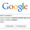
This is the mark of all websites that last a long time. All of the most popular websites that have been going a long time have a very simple design. They also reach the point very quickly. eBay’s home page and layout says, “buy stuff here”, and Google starts with nothing but a search bar. Amazon looks like a 90’s office computer indexing system.
Add Fun Elements if the Website is Supposed to be Fun

If your primary aim is to have a website that looks and feels fun, then add fun elements. Let people play mini games on the home page, or have the eyes of the pictures move to follow your mouse button. Have small animations run on your website, and have it react to the things that the user clicks.
Add Moving/Musical/Visual Elements if Your Website is Supposed to be Exciting
An exciting website cannot be exciting with just a few fancy fonts and bit of web design. Add music to the site, but make sure there is a visible mute button. Add visual elements that move, or images that stir the imagination.
The Rendering Time is Very Important
The render time is the time it takes for the website to appear on the screen. When you click a link, or open a link up in a new tab, the screen goes all white. The render time is the time it takes for the screen to go from black, to beginning to load the page (i.e. something appears other than white). If the rendering time is more than two or three seconds then most people will give up and close the tab, or hit the “back” button.
The Loading Time is Very Important

Google monitor the loading times of websites with their Chrome browser. People access your site with Chrome, and Google measures how long it takes for your website to complete loading. The longer it takes to load, then the lower down the search engine results page your site will appear. The loading time will also have a very negative effect on your website’s usability. Very few people are willing to wait around for your website to load, because it is very frustrating.
The Layout Must be Uncluttered and Fresh
A cluttered layout is the first thing that puts many people off. Many people are going to become frustrated if they have to work hard to read your website or web page content. You need to make the process as easy as possible. This means keeping the “white” percentage of your website to around 60-80%, and making sure that your website looks fresh. You can do this by applying the most recent design trends to your website. For example, the flashing star graphic on a website will make it look old and ugly.
Do Not Copy the Design of Your Competitor
Some people do this to allow the user to feel more comfortable and at home. It places them in a setting in which they feel comfortable. However, it is the opposite of building your own brand, and the first impression may be that your website is a cheap knock-off of your competitor’s website.
Remove Your Affiliate Advertising Unless It is Your Primary Website Goal
Affiliate advertising is the mark of a website that does not have a major draw or a laudable use. It is the sign of a webmaster who cares more about making a few cents per month than catering to his/her website users needs. Remove them and your website’s first impression will come across a lot better. That is unless your primary goal is to gain affiliate adverting money, in which case you should simply make your adverts less imposing and less offensive to the eye.

You May Also Like:
 Few Web Design Practices to Leave Behind In 2013
 Best E-Commerce Design of All the Time
 10 Essential Things to Remember While Doing Ecommerce Web Design
 The Best User Interface Design in a Responsive World
 What You Can Learn About Website Design from Gaming Websites
 8 Serious Web Design Mistakes You Must Avoid
 It Won’t Work! 20 Worst Web Design Fails
 Understanding the Role of Graphics in Web Design