Impacts of Gestalt Psychology on Modern Web Design
Gestalt psychology is an approach to psychology that has seen limited use in the United States from a clinical standpoint. One area in which it has provided stark insight, however, is in the area of web page design and how automatic responses from the human mind can inform better implementation methodologies.

Gestalt is largely founded on the premise that the human mind cognizes organizational features of what is seen before it is ever consciously perceived. In other words, the mind tends to group things according to quick and dirty rules, which allow us to instantly recognize patterns and even notice differences in objects.
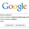
These principles, if embraced, hold the potential to give website navigation a subconscious depth that can improve both user perception as well as usability while reducing unintentional cues. The point of web design, after all, is to get users to an online portal and keep them there long enough to not only provide a product or service but also create an impression to shape their habits in the future. By using five basic concepts of organizational association, it is possible to drive consumers’ subconscious perceptions. Given that gestalt informs us that, in many scenarios, there are as few as 50 milliseconds to make that first impression, the use of such deeply ingrained psychology in designing webpages is becoming necessary just to remain competitive.
1. Proximity
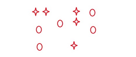
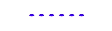
Proximity is something that can be leveraged in order to make websites easier to navigate, and it is one of the strongest forms of association. A salient example of the power of proximity over other factors of relation is detailed in the example below:
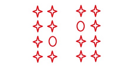
Despite the fact that each grouping contains an object that is obviously not part of a group, the association between the objects in both groups is obvious. This willingness to force organization onto things we see is referred to as confirmation bias. By being aware of a relative ranking in regard to these factors, it is possible to avoid conflicts between predictable confirmation bias and website navigation features.
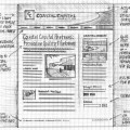
2. Similarity
Similarity is something that defies absolute definition but can be achieved by various means. Shape is an obvious one, as depicted below, but automatic cognitive grouping occurs with objects of similar color, size, or even features such as angularness or roundness.
An excellent example of proper use of this principle is to use different bulletpoints to highlight web features that are meant to be associated and also allows a designer to add an extra element of separation. This is especially useful when trying to display large amounts of data in a small area and do not want to delineate page sections with borders.
3. Closure
Closure is best described as the tendency for the human mind to see things as meaningful symbols rather than discrete lines and parts.
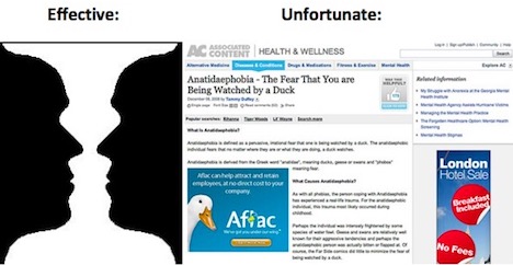
The principle of closure is something that can be as harmful to a web designer as helpful. The tendency for the human mind to finish incomplete thoughts, sentences, images, or virtually any other sensory input that may elicit preconceived notions can lead to unintended and unfortunate cognitive associations with content. However, the dissonance need not always be negative and the principle can be employed as a visually stunning element that can force a user’s gaze to linger. The important part is to be aware that accidental association can be damaging to consumer perception.
4. Good Continuations
The human mind tends to try to order things and when order is absent in complex displays, such as in webpages, there is a perception of chaos.
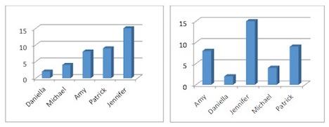
The display of data here shows that good continuation has a marked effect on the processing of information. The first chart displays the exact same data as the second even though the second has even been ordered alphabetically. The clear appearance of chaos in the second figure also highlights the immediacy with which gestalt concepts affect what is seen. There is not even time enough to cognize alphabetic organization before negative perception creeps in.
5. Common Fate
As the name would tend to imply, shared fate is a connection that becomes obvious when changes occur differently for more than one group of objects.
This method of organization is most commonly used in drop-down menus as a method of delineating groups of common objects. While the example below represents a menu that uses bordered sections, they only reinforce the organization that is created through shared fate.
Each of these principles reflects a direct and actionable approach to the development of individual and combined webpage elements. Every webmaster is eventually faced with the fact that a pretty picture tends to outdo an information rich data resource, and overt usability tends to take a backseat to attractiveness. Websites that are obviously less effective at accomplishing their intended purpose have been known to garner user re-visitation simply because they adhere more closely to a consumer’s concept of beauty. In fact, when a user’s visit to a website focuses on exploration rather than finding a specific utility, the effects of attractiveness are even greater. By analyzing a webpage from the standpoint of Gestalt connectedness, you can ensure that subconscious dissonance and organizational asymmetry do not play a role in developing negative user perceptions of the site despite otherwise effectively implemented content.

You May Also Like:
 User Experience Design UX: The Worst and the Best
 7 Top of the Line Web Design Trends for 2014
 How Online Banking Sites Mastered Their Web Design
 Top 20 Websites to Showcase Your Design & Art Works
 37 Best Wireframing, Prototyping and Mockup Tools for Web Design
 Wireframe Forms A Pivotal Part Of The Web Design Category With Other Uses Too
 25 Extremely Creative Web Design for Your Inspiration
 10 Popular Web Design Trends You Should Follow in 2015
Tags: graphic design resources, psychology, web design resources