It Won’t Work! 20 Worst Web Design Fails
It is always important to be updated with all the latest trends when it comes to having a great website for your business or profession. Similar to fashion and music trends, web design trends are also not static. They change at a very neck – breaking speed due to rapid advancement in technology and new generation web savvy users who easily get bored of things.

Like any technology, web design trends are hot one day and almost forgotten the next. Following unattractive and outdated website design elements and features can increase your website’s bounce rate.
As a result, you will be displeased with the amount of traffic you generate every month. The website you built for your business five years ago will not be going to work today, so it is very important for you to be acquainted with the trends that you should abandon today.
Here we have got 20 website design trends that are already outdated and you should avoid using them!
1. Screen slides with meaningless call to action
Screen with meaningless call to action is an outdated trend that not going to work anymore this year. They scroll too fast, as a result the prospective customer will miss the important message. Screen slides with meaningless call to action can be so bad for your website that only 1% of your visitors are actually clicking on them. It’s only a white noise for folks; they don’t find it interesting anymore.

Try not to use screen slides with meaningless call to action, instead of it, keep your website simple and to the point so that you’re prospective customers can get the message within 15 seconds by looking at your website home page. It is because; majority of customers who visit your website spends only 15 seconds on it before clicking it off. So that means you don’t have time to waste on rotating screen slides, you have only 15 seconds to capture their attention and present them information that will help them invest in your brand. Too much happening and rotating slides on a home page with no clear call to actions make your website irritating for your visitors.
2. Too much design
An over designed website that is full of messy images, text, animated effects and colors is not appealing to visitors. Over- designed websites can never attract visitors, instead of finding them interesting visitors find them very frustrating. They only produce noise and cannot covey the core idea of what your business or brand is all about.
The average prospective visitor is impatient and they don’t like finding the information in a messy website. If your website is messy and over designed, they will simply dump you and choose your competitor or substitute website with simple and streamlined design and more efficient user interface. Employing too much design can harm your website’s search engine rankings and increase your website’s bounce rate. So try to keep your website simple, streamlined and efficient communicating to visitors.
3. Flat and boring graphics
Microsoft was the first who took flat graphic designs to extreme. But the idea of using flat and boring graphics will not work for your website anymore. Do not build a website with flat and boring graphics. Sites with big buttons and 3D gradients and shadows might look good but visitors don’t find them interesting because of poor user interface. If you are using a flat design for website it is very important to use them very carefully.
Do not overload using flat graphics on your website. The biggest problem with the flat design is visitors cannot figure out what and where a button is. Buttons blend with flat graphics and do not give visitors a good interactive experience. Visitors find website with flat graphics tough to interact.
A website design should be easy accessible to visitors and have all the abilities to navigate, understand your user interface successfully. It is ok if you are using flat design in your website in little extent but make sure that your website is easy to access for your users and you are doing justice with UI terms.
4. Hamburger menus are outdated
Using Hamburger menus on a website is not a good idea. Hamburger menus were originally designed for smaller screened device like: smart phones, tablets and IOS devices. They are perfect for small screened devices but non-mobile users don’t understand the function of the three stacked lines.
An ideal website should be good for both mobile and non-mobile users. Hamburgers menus are not user friendly for desktop users. Navigation of website should be clear and in front of the eyes of the users. It should not be behind the three stacked lines. So end using this already outdated web design trend. Limit them to only small screened devices where they belong to.
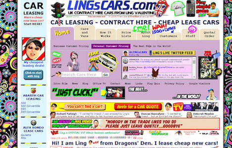
5. An overloaded or crowded content
Do not fill your website with cluttered and unorganized content. Some website owners try to present too much information on the pages and do not use whitespaces (empty spaces between website elements) correctly. A messy looking website with overloaded content and poor use of whitespaces are not eye pleasing to visitors.
Google also penalizes websites with overloaded or crowded content and does not consider them in search engine rankings. Your website should have optimized content with right use of whitespaces that can correctly direct the flow of your visitor’s eyes. Try to keep your website content to the point and make sure that you have described the core idea of business and benefits that you customer will gain by investing in your product or services.
6. Auto playing audios and videos

Including audios and videos in your website is pretty ok but having it start automatically is not. Automatic audio and videos make websites very unwelcome to visitors. Whether you have put a video on a home page or about me, you should never force your visitors to watch your videos. It can cause a frustration to your potential visitors or customers. So stop putting automatic playing audios and videos in your website otherwise many users will simply exit out of your website and go to your competitor either.
7. Auto play ads
No doubt, auto-play ads offer a great way for your website to bring some profit in. But they are same annoying like auto playing videos and audios for visitors. So try to limit the ad section in your website. Dump auto play ad tactics if you can afford or go with ads with no sound. Ads with sounds create intrusion between the visitors so do not continue keeping ads with sounds.
8. Irritating pop up ads
Nobody wants to see your popup. Whether your popup is about liking you on Facebook, joining you on newsletter, enter a competition or chat with a live representative. Big popup that flashes on the screen again and again can be very annoying for your visitors or customers’. They can distract your potential visitors. There might be possibility that your visitors get irritated and exit your website without reading the core idea of your business. Be very careful if you are using pop-up for interaction with your visitors. Make sure you are not irritating your visitors with flashing Popup.
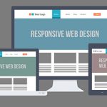
9. Non mobile friendly website design

A big population of internet users accesses the internet on the mobile only. More than half of the local searches are performing with mobile devices only. If your website’ design is non mobile friendly that means you are losing out a big population of your potential customers.
Even Google speaks about penalizing non-mobile friendly websites in its recent announcements. If your website is lacking here and not designed for mobile users, it is the right time for you to make an update to mobile friendly website design. This is a most important update that you essentially have to follow if you want to increase your visitors or customers.
10. Bad use of stock photos
Using visual images is one of the best ways to market your business website or business’s core idea. A website with good uses of images always attracts and engages visitors. But you have to be very careful while choosing images for images. Choosing cheesy fake and unrealistic stock photos for websites can remove the legitimacy from your brand or website.
Do not pick images that someone is already using on their website. If your visitors have seen you picking images from other website then it can leave a bad impression about your brad in the market. Your images should be yours only. Remember that the bad use of stock photos can create a strong negative impact in your visitors. It even can turn your company into a laughing stock. So be very careful while stocking photos for your website.
11. Skeuomorphic design
Stop employing skeuomorphic design (graphic design that looks like real world item). Apple introduced Skeuomorphism design with its first iPhone launch. This trend had gained a huge popularity among iPhone users but unfortunately using this trend for website designing is a flop. Although using this trend for call to action is quite good but building a whole website using this trend is not always visually appealing.
This trend is already outdated and not liked by web savvy visitors. If your website currently employs skeuomorphic design elements then it’s a right time to update your website with hot web design trends, because skeuomorphic design may no longer liking by your visitors.
12. Excessive java script
Every website today uses at least some java script. It is important because the use of java script in the website adds functionality as well as enhances user experience of your brand or business. But you should not use too much java script. Remember putting excessive java script takes a lot of time to load. So before installing every possible plug-in, widget ad script, ensure if you really want them on your website or not.
13. Sidebars are obsolete
Sidebars serve no purpose other than making noise. Popular websites have removed side bars from their websites. Amazon, eBay and Esty are the examples that have removed sidebars from their websites. Many marketers see websites as an opportunity to promote pages, offers and collect mail addresses. If nobody is looking there at first place then it has no mean.
Majority of visitor contact website or business owners by clicking the contact us page. Side bars only create noise and make website crowded. It is better to create a separate page for contacting website owner rather than putting sidebars in a website.
14. Large wall text
Large wall text on websites looks so old fashioned. Website designers should avoid applying large wall text on their pages. Titles, subtitles should not be of large sized. They look ugly and not eye appealing to visitors. There was a time when website designers used to apply large wall text on their websites, but today this trend is totally eliminated. Nobody likes seeing extra large wall text on the website.
15. Outdated font text and style elements
You should not use outdated font text and style elements in your website. There are only few web designers’ favorite fonts that are also pleasing to visitors. You should only pick the best and popular fonts so that your website would not look outdated. Be careful of not picking too much font styles for your website. Using too much font styles can make your website ugly and unattractive to visitors. It can also cost your brand value and reputation.
16. Flash introduction of website
Flash introduction is an outdated technique. It was a popular web design trend a decade ago but does not work today. Flash intros on the websites are not Google friendly. Using flash introduction can hurt your SEO effort. Some of the mobile devices do not support flash intros. Using them as your websites’ core design means disappointing huge number mobile visitors. It is better to eliminate this technique and opt for hot new website trends.
17. Infinite scrolling web pages
This is a feature most visitors don’t want to see on the websites. Websites that never reach to their footer is the most frustrating thing for the visitors. Visitors find infinite scrolling web pages so annoying. Nobody likes reading long never ending posts or information. Visitors simply click exit button and go for alternative website with short and simple user interface. Instead of scrolling visitors like clicking a button or link that could send him to next page or article. If you are still employing this frustrating trend then dump it from today.
18. Stop using rainbow color scheme
Stop using rainbow color scheme. Your website is not for attracting kids. Today, visitors like websites with simple color scheme. They don’t find rainbow colored scheme attractive anymore. Use only one or two colors with a possible third accent color.
19. Non interactive navigation
You website design should not be non interactive. It should be visually appealing and good in term of navigation. Do not pick non standard design for your website. Try to use generic labels that do describe your business core purposes and your business contact details. Using generic labels with proper navigation will help you to reduce your website’s bounce rate. Try to limit using drop down menus. Majority of users find drop down menus frustrating. Do not keep too many items in your navigation. Try not to make your website confusing for your visitors. Instead make it simple and to the point.
20. Using too many trends
Having a trendy website is not bad but using too many trends all together makes your website awful for visitors. Do not fill your websites with so many trends. Having useful content is more important than following all website designing trend. Make sure your website has relevant content. Using so many trends all together will only create noise and distract your visitors. Use trends that will actuality look good and enhance your websites user interface.

You May Also Like:
 User Experience Design UX: The Worst and the Best
 8 Website Design Trends to Follow in 2015 / 2016
 10 Popular Web Design Trends You Should Follow in 2015
 The Best User Interface Design in a Responsive World
 7 Top of the Line Web Design Trends for 2014
 Few Web Design Practices to Leave Behind In 2013
 8 Check Points Why Your Website Needs to be Redesigned
 10 Essential Things to Remember While Doing Ecommerce Web Design
Tags: trends, web design resources, web development resources